To illustrate how typeface design affects how we read, Chris Gayomali describes an experiment by Phil Renaud, a college student who noticed his grades were climbing despite no conscious attempt to improve his performance:
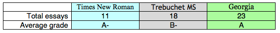
What he did change, however, was his essay font — three times, in fact. Renaud went back and looked at his [52] essay scores and the different typefaces he’d used when he submitted his work. His papers were handed to his professors in three different fonts: Times New Roman, Trebuchet MS, and Georgia. Here’s what he tallied:
Why did Georgia — which he switched to later on in his college career — perform better than the others? Here’s what Renaud wrote:
Maybe fonts speak a lot louder than we think they do. Especially to a professor who has to wade through a collection of them; Times seems to be the norm, so it really doesn’t set off any subconscious triggers. Georgia is enough like Times to retain its academic feel, and is different enough to be something of a relief for the grader. Trebuchet seems to set off a negative trigger, maybe just based on the fact that it’s not as easy to read in print, maybe on the fact that it looks like something off a blog rather than an academic journal. Who knows. [Source]
For the record, the Dish comes to you in Georgia. In other font news, graphic designer Sang Mun has created an “NSA-proof font”:
Sang has no illusions that even a clever cryptographic font—which he says you can use in email messages to shield them from snoops and font-recognition bots—will remain encoded for long. They’re not meant to be long-term tools with which to combat the NSA. Rather, he views them as an awareness-raising measure.
Earlier Dish on typeface here.
(Hat tip: Tess Malone)
