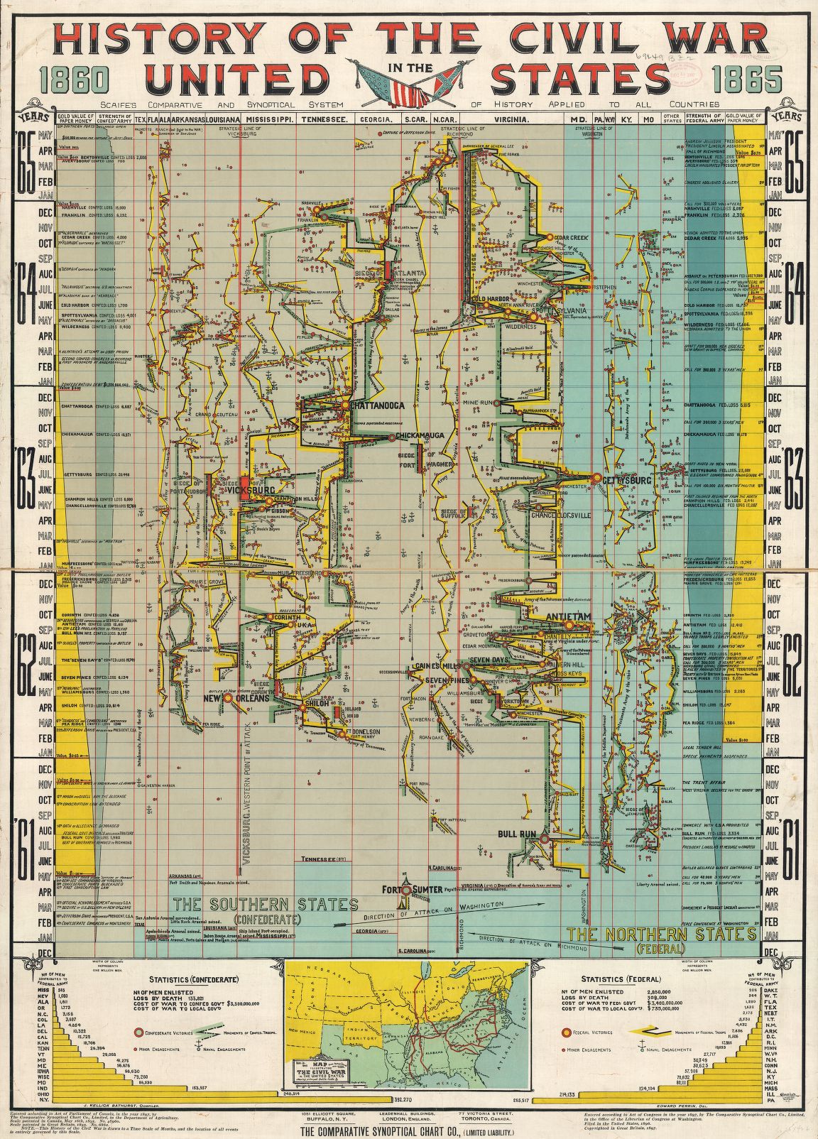
Rebecca Onion passes along the above chart, which “depicts major battles, troop losses, skirmishes, and other events in the American Civil War.” She focuses on a few parts:
A war is a complicated thing, and the chart has tried to track so many factors—geographical, political, and financial—that it’s easiest to concentrate on one or two of these at a time.
I noticed, for example, that the far left-hand column charts the decline in value of Confederate dollars, from one U.S. dollar in May 1861 to “nil” in April 1865, while the far right-hand column shows the decline in value of Union currency in relationship to gold, from $1 in February 1862 to $0.75 in April 1865. Perhaps the best way to approach such a chart is to give up on complete “synoptical” understanding, and delight in those details.
A zoomable version of the graphic is here.
