Brad Plumer features maps from the National Climate Assessment, which was released this week:
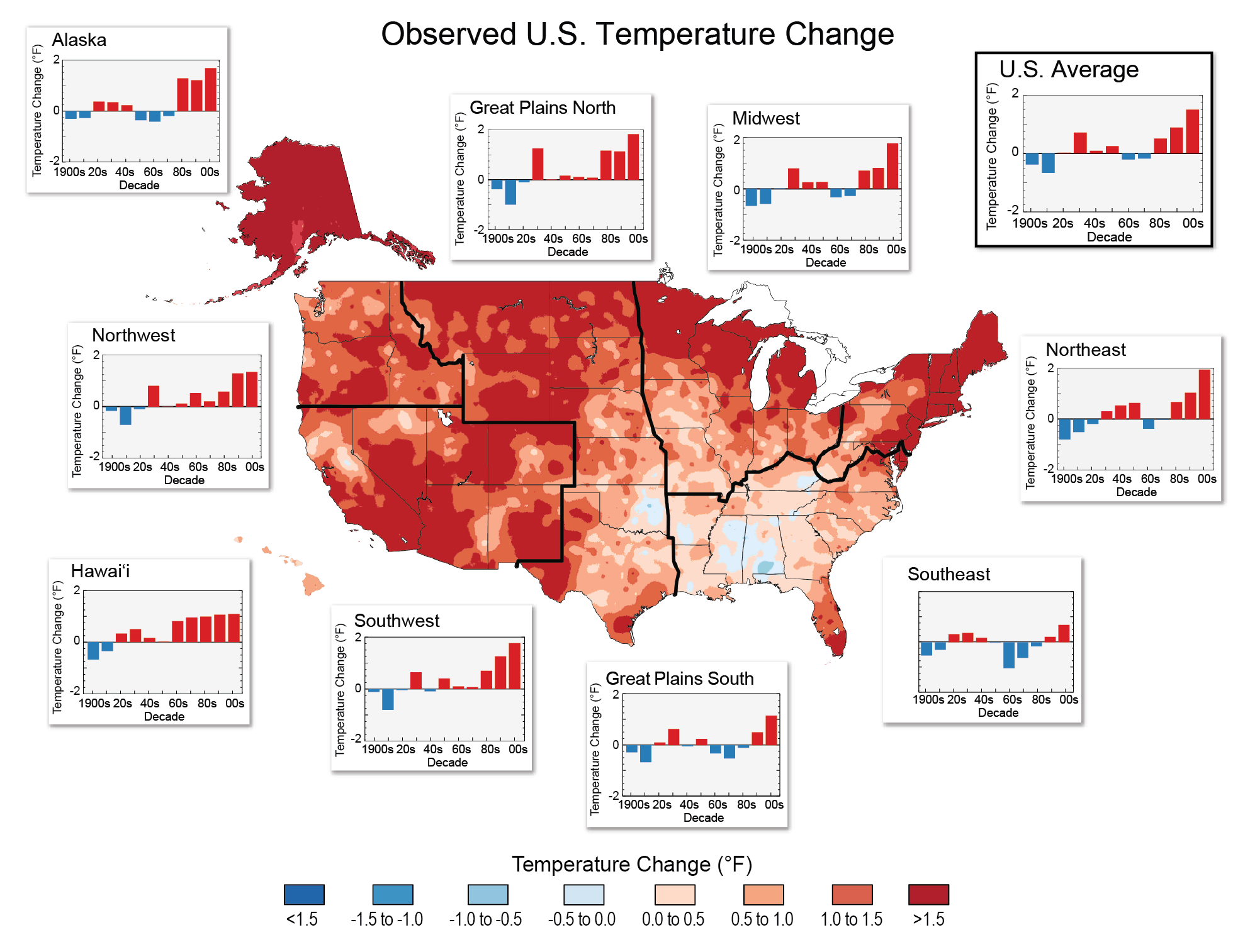
This map is the simplest way to see global warming in action. Since the 19th century, average US temperatures have risen by 1.3°F to 1.9°F. (Note, though, there have been some fluctuations here and there: in the 1960s and 1970s, temperatures dipped, partly due to the cooling effect of sulfate pollution that was eventually cleaned up.)
Recent decades have been even hotter: since 1991, every region in the United States has been warming, with the biggest temperature increases occurring in the winter and spring.
Peter Coy observes how the report “tries to shake people awake by making climate change up close, personal, and present, rather than abstract and in the future”:
The risk of this up-close-and-personal approach is that it could make some fence-sitters on climate change feel manipulated. The atmosphere is a complex system, and scientists don’t know enough about it to trace every regional variation in climate straight back to global warming.
The benefit is that there’s a strong scientific consensus that on the whole, climate change is causing an increase in extreme weather. The authors of the National Climate Assessment are betting that people will be more impressed by shoreline scouring in the Great Lakes than by the latest prediction regarding average sea temperatures in the western Pacific a century from now.
Chris Mooney looks at specifics:
According to the assessment, the Western drought of recent years “represents the driest conditions in 800 years.” Some of the worst consequences were in Texas and Oklahoma in 2011 and 2012, where the total cost to agriculture amounted to $10 billion. The rate of loss of water in these states was “double the long-term average,” reports the assessment. And of course, future trends augur more of the same, or worse, with the Southwest to be particularly hard hit. As seen in the image at right, projected “snow water equivalent,” or water held in snowpack, will decline dramatically across this area over the course of the century.
And then there is Alaska:
Nowhere is global warming more stark than in our only Arctic state. Temperatures there have increased much more than the national average: 3 degrees Fahrenheit since 1949, or “double the rest of the country.” The state has the United States’ biggest and most dramatic glaciers—and it is losing them rapidly. Meanwhile, storms batter coasts that used to be insulated by now-vanished sea ice.
Ben Adler provides more highlights:
“Heat kills people, and it sends thousands of people to emergency rooms because climate change fuels longer and more severe heat waves,” says Kim Knowlton, a scientist with NRDC’s health and environment program and an author of the Human Health chapter of the NCA. “There will be 10 more days over 100 degrees for the entire country on average from 2021 to 2050,” notes Liz Perera, a federal climate policy analyst at the Sierra Club. “The interesting thing there is that regionally there’s actually quite a distribution difference. It will be worst in the Southwest, Southeast, and Great Plains.” Those, of course, are already the places with the harshest summers. The U.S. has recently seen its worst heat waves in history, and increasing casualties as a result. A study published in the journal Epidemiology found, for example, that in July 2006, “California experienced a heat wave of unprecedented magnitude and geographic extent … Coroners attributed 140 deaths to hyperthermia, and it has been estimated from vital statistics data that in excess of 600 heat-related deaths may have occurred over a 17-day period.” The study also found that climate change is causing worse humidity to accompany heat waves, making them more unpleasant and dangerous.
