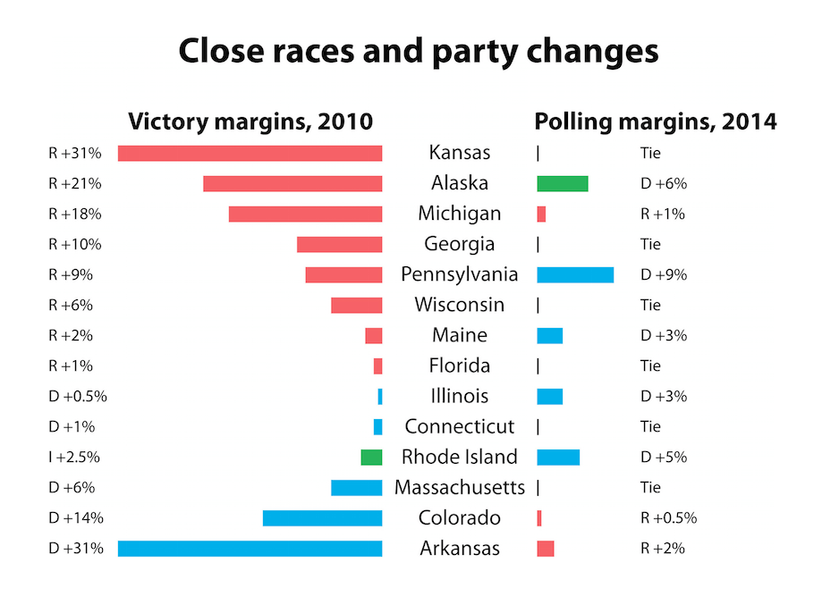
Sam Wang illustrates how “the overall picture of 36 gubernatorial races is not breaking in the Republicans’ direction”:
This chart—calculated from HuffPost Pollster data, using the median-based approach of the Princeton Election Consortium—shows elections that are likely to result in a switch in party control or are polling with a margin of five percentage points or less. On the left are the margins by which sitting governors won in 2010. On the right is the median performance of this year’s candidates in polls completed in the last two weeks. Red indicates a Republican in the lead, blue indicates a Democrat, and green indicates an independent.
The most remarkable feature of this chart is the widespread weakness in the Republican field. … The median outcome is a net gain of one governorship by Democrats.
