A reader provides a much different take on oceans heating up:
I’ve been long bothered about how climate scientists and pundits have been stretching the truth a bit on the effects of global warming, and in trying to “win” the news cycle. The latest is the narrative about 2014 being the warmest on record. Now, I’m not going to harp about whether statistically speaking it’s the warmest or not, because to be honest, I think it’s somewhat irrelevant. Let me be clear: the Earth is warming. It is going to be a problem someday. We have good reasons to decarbonize our economy even if that weren’t the case.
However, some of the things being said just drive me nuts. First off, I should mention that I’m a meteorologist. I’m a weather forecaster. I’m not a climate scientist, so I’m not an expert on this. But I have been interested in the subject for over 15 years.
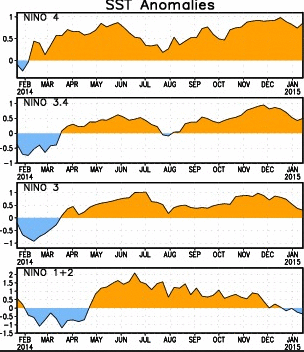
First, regarding that this is an El Niño neutral year. This is true. By a technicality. For NOAA to call an El Niño, it requires the temperature in a certain section (the Niño 3.4 region) of the tropical Pacific to be greater than 0.5 degrees Celsius more than average, for a period of 5 months. Here’s what we’ve had:
You can see that the Niño 3.4 region was warm … nearly El Niño criteria for much of the first half of the year, and near or above the criteria over the last several months. But not quite breaking it. Further west, in the Niño 4 region, it was quite a bit warmer. So yes, technically not an El Nino year, but almost.
In addition, that assumes that we’re looking at classical El Niño. Recently there’s been research on a 2nd flavor of El Niño, called El Niño Modoki, which has the warm water focused on the central Pacific, rather than the “classical” eastern Pacific. The interesting thing is that El Niño Modoki has actually been the dominant type of El Niño since the early ’90s, and there’s research that indicates that global warming may be the reason for that. I don’t have access to a current El Niño Modoki index, but eyeballing it, plus given that the weather patterns we’re experiencing are typical of an El Niño Modoki, make me thing that we could be seeing one.
But my point here is that the narrative that the record-breaking temperature was not enhanced by an El Niño is wrong. It’s only because it just barely missed the criteria. Several people, including Phil Plait, have used this record to state that there is no pause in global warming. They’re wrong. But just because there is a pause doesn’t mean that global warming has stopped.
Now, many people like to use 1998 as the start of the pause. I don’t. Because it’s cherry picking, as has been pointed out before. It’s taking an unusual spike in temperatures and using that as a start point. If you pretend that 1998 didn’t happen, you can see that temperatures continued to rise for several years afterwards.
However, “warmists” are completely discounting that there are natural variations in climate. The IPCC acknowledges the existence of the pause. There are climate patterns that have periods on the order of 30-60 years. One is called the Pacific Decadal Oscillation (PDO), which is a pattern of sea surface temperature anomalies in the North Pacific. Recent shifts in this oscillation occurred in 1946, 1977, and 2006.
A second is the Atlantic Multidecadal Oscillation (AMO), which is something similar but for the Atlantic Ocean:
The interesting thing is how these patterns correspond to changes in global average temperature.
Global average temperature has periods where there is rapid rise, and then a plateau. We have the first rise, from roughly 1910 to the mid 1940s. This corresponds to the time where the PDO was neutral for a good chunk of time, but it then turned to the “warm” phase near the end. The AMO bottomed out in the early 1910s and then rose until peaking around 1950.
Then we have a bit of a drop and then a plateau in temperatures in the mid ’40s until the late ’70s. During this period the PDO had flipped to the “cold” phase, and the AMO was dropping.
Then in the late ’70s we get the rapid rise until the mid 2000s. The PDO had flipped to the “warm” phase, and the AMO was rising.
Finally we get to the start of our pause. The PDO flipped to the “cold” phase in 2006, and the AMO hit a plateau. Some people are denying that we’re in a pause. All I can say to them is look at that graph above. Would you be happy if your 401K had a chart that looked like that if you started in 2000?
It’s as if the contributions to global average temperature are roughly half and half between long natural cycles and man-made global warming, such that during periods when the natural cycles are warming, we get quick, alarming warming. But then during periods when those natural cycles are cooling, it’s enough to pretty much balance out the warming from CO2.
Now, yes, it’s only been 10 years for my definition of the pause. But my definition is based on actual physical processes, and not by cherry-picking a year. It is completely consistent with previous pauses and sudden rises. And even if we’re going to continue warming, the warming isn’t going to be anywhere near what it was like in the 1977-2006 period.
So what does this mean going ahead? Here’s what I think is going to happen.
The AMO will start to decrease in the next five years, and will probably bottom out in about 20 years. The PDO isn’t expected to switch until sometime in the 2030s. So I think that the pause (which still may result in slight warming) will continue until then. This prediction will be considered falsified if the increase in global average temperature over the next 5 years is greater than 0.10 C per decade.
I also think we’ve seen the bottoming out of the Arctic ice loss. We’ve started to see a recovery and I think it will continue. I’m not completely sure on that because the AMO hasn’t started to drop yet though. So I will consider this prediction falsified if we have two or more new minimums in Arctic ice in the next five years.
And then watch out, because our temps are going to start to spike and I suspect at a greater rate than the 1977-2006 period.
The bottom line is this: just because some of us think that a pause is in place doesn’t mean we’re deniers. It doesn’t mean that we don’t think it’s a problem. I do think we need better climate models that can handle these natural variations, but I think that’s coming. The longer the pause goes, the more scientists are going to realize the need for taking these natural variations into account.


Regarding the reader’s claim that “we’ve started to see a recovery” in Arctic ice, here’s his foil, Phil Plait, last September:
This time, in Sunday’s Mail Online, [David Rose] writes that Arctic sea ice, which hit a major record low in 2012, “has expanded for the second year in succession.” This claim is a humdinger, and typical denial double-speak. It’s technically true, but also really wrong. It’s like examining someone who has a 106° fever and saying it’s really made their skin glow. But what do you expect from an article that has this breathless headline:
Myth of arctic meltdown: Stunning satellite images show summer ice cap is thicker and covers 1.7million square kilometres MORE than 2 years ago…despite Al Gore’s prediction it would be ICE-FREE by now
“Myth of arctic meltdown” is enough to tell you just how slanted and wrong the conclusions of this article will be … and the inclusion of Al Gore’s name brings it home. Mentioning Gore is at best a distraction, red meat to the deniers. Gore isn’t a climate scientist, and as we well know actual climate scientists overwhelmingly agree that the world is warming. One of the outcomes of this is the decline of Arctic sea ice.
Briefly: Arctic sea ice reaches a minimum in late September every year. The overall trend for the amount of ice at that time is decreasing; in other words, there is less ice all the time. Some years there is more than others, some less. But the trend is down, down, down.
In 2012, a mix of unusual causes created conditions where the minimum reached a record low, far below normal. The next year, in 2013, the ice didn’t reach quite so low a minimum extent, and this year looks very much the same as 2013. But saying the ice is “recovering” is, to put it delicately, what comes out the south end of a north-facing bull. You can’t compare two years with a record low the year before that was due to unusual circumstances; you have to look at the average over time.
Of course, if you do, your claims that global warming isn’t real melt away. I’m happy to provide that information. Here’s the Arctic ice extent graphed by the National Snow and Ice Data Center:
The black line is the average for 1981–2010. The gray region shows the ±2 standard deviation extent for that average; statistically speaking it’s an expected range of extent (it’s actually more subtle than that, but that’s enough to understand what’s going on here). The dashed line shows the 2012 ice extent, and is clearly very low, well outside the expected range. The brown line is 2013, and the light green line is this year, 2014, up to late August. Notice 2014 follows the year before pretty closely.
Note also they are well below average, near the bottom of the expected range. If you look at any recent year’s ice it’s below average; you have to go back to 2001 to find an ice extent near the average.
So the claim that the ice is “recovering” is made based on the wrong comparison. Compare the past two years to the overall trend and they fit in pretty well with overall decline.

