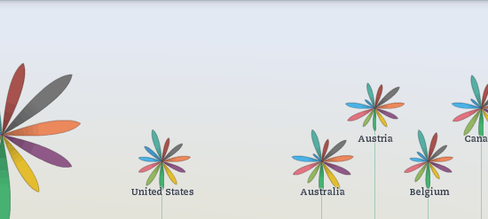
Organisation for Economic Co-operation and Development (OECD) has an interactive chart that allows you to input which quality of life inputs matter most (such as safety or work-life balance), and orders 34 countries accordingly. Nathan Yau swoons:
[E]ach country is represented with a flower, and each petal on a flower represents a metric. The higher the index, the higher the flower appears on the vertical axis, and if the flower metaphor is too abstract for you, roll over each flower to see the breakdown by bar graph.
… [Y]ou can focus on specific topics such as housing to see how countries rank in each area and information on what indicators were used to compute each sub-index. The environment index, for example, is based solely on air pollution levels, whereas the education index takes educational attainment and reading skills into account. So whether you're interested in a specific country, topic, or a group of topics, the interactive tools lets you see world data from plenty of angles.
Alex Tabarrok advises:
If you don’t like the OECDs better life ranking, here is Oprah’s best life series.