by Zoë Pollock
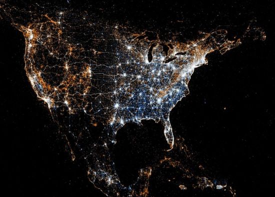
In Eric Fischer's new series See Something or Say Something, geocoded tweets and Flickr photos to paint a picture of the US. Blue dots represent tweets with location, orange dots are Flickr photos and white dots are places with both. Nathan Yau takes a closer look:
Not surprisingly, you see a lot of white dots at city centers. That's an artifact of population density and Flickr and Twitter users. What's more interesting though are the areas outside of the city dominated by blue and orange. For example, in the North America map above, the east is dominated by blue, whereas the west seems to be more orange. What compels people to tweet over taking a picture and vice versa? Or are we just seeing a Twitter scrape that happened in the early morning, before the west coast woke up?
Or as Marina Galperina puts it:
Tokyo prefers Twitter, San Francisco favors Flickr and Manhattan is ablaze with social media exhibitionism.