
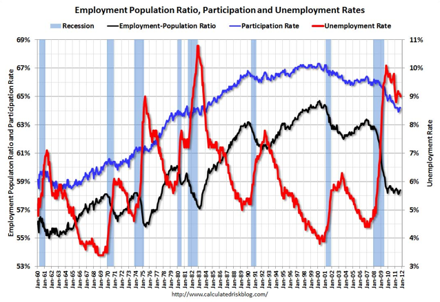
The unemployment rate fell by more than expected. The above chart from Calculated Risk helps explain how this happened:
The Labor Force Participation Rate was declined to 64.0% in November (blue line). This is the percentage of the working age population in the labor force. The participation rate is well below the 66% to 67% rate that was normal over the last 20 years, although some of the decline is due to the aging population.
Brad Plumer digs deeper:
[S]ome economists have argued that the labor force participation rate has been steadily shrinking over time due to structural changes in the economy. It’s not just the horrible job market that’s responsible. The Congressional Budget Office, for instance, expects the participation rate to keep dropping in the years to come, even after the economy recovers. Why is that? For one, the baby boomers will all start retiring. But the share of women who chose to work has also fallen to its lowest level in nearly 20 years. And, at the same time, the percentage of young people who are looking for work has dropped by quite a bit.
Felix Salmon focuses on the Employment-Population ratio (the black line above):
[W]hile numbers matter in election campaigns, it’s people who vote. And they vote based on their own personal experiences, rather than on macroeconomic statistics. And the fact is that if you’re a person in America, the likelihood that you have a job was unchanged this month: the employment-to-population ratio ticked up just one tenth of one percentage point.
Pejman Yousefzadeh makes related points:
[O]nce we get past the surprise of having the unemployment rate fall below 9%–and it is a measure of just how bad the jobs situation is that a fall below 9% counts as a “surprise”–we are still left with a nasty jobs picture. And that means–among other things–a nasty political picture for President Obama, as he heads into the 2012 election cycle.
Doug Mataconis disagrees:
[T]he political importance of the topline unemployment number dropping shouldn’t be underestimated. Notwithstanding the fact that job growth remains anemic, there’s a psychological difference between saying “9% unemployment” and “8% unemployment,” not a big one to be sure, but a difference nonetheless.
Sarah Kliff finds some reason to cheer:
Politico’s Ben White posts this helpful chart, from Hamilton Place Strategies, that shows how much jobs numbers have been tweaked. All told, the Bureau of Labor Statistics have added 231,000 more jobs to their initial estimates just over the past three months:
Greg Ip is also relatively upbeat:
Today's report is no anomaly; it comes on the heels of a run of good data that suggests the American economy so far is defying the recessionary tug from Europe. … What's behind this? I think the best explanation is that a decent recovery would have begun a year ago but for a run of bad luck: the Japanese earthquake and tsunami, the run up in oil prices following the Arab Spring, and the political brinkmanshp in America over the debt ceiling and in Europe over its sovereign-debt crisis.
Jared Bernstein is more negative:
[T]here’s still a great deal of slack in the job market. Average weekly hours worked didn’t budge and hourly wages ticked down slightly—over the past year, hourly earnings, before inflation, are up 1.8%, well behind inflation. In other words, we’re a long way away from providing job seekers and workers with the job and wage increases they need to get ahead. Outside of the public sector, we’re at least moving in the right direction, but very slowly.
More charts on today's jobs report here. I'm impressed by the revisions upward in recent months. It's a change when the revisions end up under-estimating employment, rather than over-estimating this. All in all, I suspect there are some better moods at the White House this morning.
