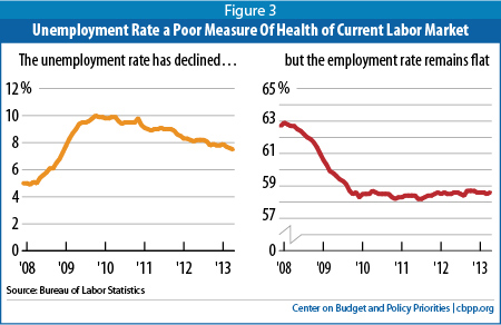
Ezra Klein declares that the comparison seen above “calls the entire economic recovery into question”:
[T]here are two ways to leave the ranks of the unemployed. One way — the good way — is to get a job. The other way is to stop looking for work, either because you’ve retired, or become discouraged, or begun working off the books. The yellow line on the left shows the official unemployment rate since 2008. It’s fallen from over 10 percent to under 8 percent. But the red line on the right shows the actual employment rate — that is, the percentage of working-age adults with jobs. What should scare you is that the red line has barely budged.
(Chart from the Center on Budget and Policy Priorities)
