Emily Badger summarizes research on reading while driving:
Two years ago, the MIT AgeLab and Monotype began to study whether more legible typefaces could make a difference in in-car media. For men, at least, the answer has been yes. In driving simulations run by the lab, male drivers took their eyes off the road for less time when the text on a small navigation screen appeared in a typeface from what’s known as the humanist genre. The difference between humanist and grotesque typefaces amounted to the equivalent of turning away from the road over a distance of 50 feet at highway speeds.
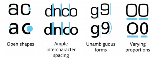
Kelsey Campbell-Dollaghan illustrates, with the above graphic, why Burlingame is easier to read:
Though Burlingame was originally designed for use in video games, [typographic firm] Monotype redesigned it for drivers based on the MIT findings. What makes it, and other “humanist” typefaces, so much less distracting? First of all, there’s absolutely no ambiguity between letters and numbers: Thanks to clever spacing techniques, it’s nearly impossible to confuse, say, the number 9 with the letter G, as you might with a square grotesque…
And see those odd oblique details on the “glyphs,” or actual letters? They make it easier to make out each glyph, even at low screen resolutions. It’s odd: You’d think the square-style, pixelated letters of the grotesque would make it better for digital interfaces. But no, the similarity of the letters and the tight spacing makes it way harder for our eyes to interpret quickly.
