Matt O’Brien sums up the good and bad news from Friday’s jobs report:
The economy added 217,000 jobs in May, and the previous two months’ reports were only revised down by 6,000. That was enough to keep the unemployment rate flat at 6.3 percent, which, as Phil Izzo points out, is better news than it sounds like since economists expected it to go back up after a fluky drop last month. … Even though we’ve gotten out of the hole from the recession, we still haven’t gotten out of the hole from our too-weak recovery. That is, there’s still a big jobs gap, and it’s going to take a long time to fill.
John Cassidy’s take:
These figures can be interpreted in a number of ways.
To me, they show that the expansionary monetary and fiscal policies enacted during the recession did what they were intended to do, and got the economy back on track. On the White House blog, Jason Furman, the chairman of the Council of Economic Advisers, pointed out that “the private sector has added 9.4 million jobs over 51 months of straight job growth.” On a monthly basis, that translates into an increase of about a hundred and eighty-five thousand jobs, which is a decent number, especially since it has been sustained for more than four years.
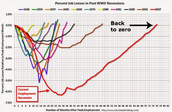
That’s the good news. The bad news is that for the American economy, whose leitmotif is expansion, to go for six and a half years without any net job growth is something we haven’t seen in eighty years. The only comparable period on record is the Great Depression.
Neil Irwin asks when we can hope to return to full employment. Turns out it’s not a simple question:
Economists think the nation is at full employment when the unemployment rate is something like 5.5 percent (it can’t fall too much lower because some people are always between jobs, and if it falls too low inflation will result). That would imply 1.24 million of the people who are currently unemployed finding themselves with a job. But that number is too simplistic — it implies a static system with the labor force consisting only of the people who were in it in May.
In reality, the labor force remains a good bit smaller than you would expect it to be given demographic trends. Presumably, if unemployment keeps falling, employers keep hiring, and worker pay starts to rise, at some point some of those people will decide they want a job after all. But it is hard to know just how big this shadow work force is. How many of the 61-year-olds who gave up looking for a job in the last few years are going to return to the labor force when they smell opportunity, and how many have retired for good?
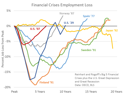
Adam Ozimek presents a counter-chart to the one above and argues that, for a recession spurred by a financial crisis, this one actually wasn’t that bad:
[Past American recessions] is not the only relevant comparison. We can also compare the current recovery to other major financial crises. The graph [to the right], from Josh Lehner, shows that in this light the U.S. recover actually doesn’t look so bad.
So which comparison is correct? Given that this recession included a serious financial panic, I’m not sure we learn much from comparing it to, say, the Volcker recession of 1980 that resulted from the attempt to reign in inflation. The comparison to other financial crises is more relevant to understand just how bad things could have been. However, simply showing that it could have been worse does not prove that policymakers could not have done better. Indeed, it would be tough for any simple comparison of recessions to show this. For that you need to take a much closer and more careful examination. But as far as these simple comparisons go, I believe it is more accurate to compare to other financial crises than to compare to other U.S. recessions.
Ben Casselman spots a bit of good news about the quality of the jobs being created:
One of the persistent concerns about the recovery has been not just that job growth has been weak, but that many of the jobs that are being created are low-wage and part-time. But as the job market strengthens, that trend may at last be reversing. Average hourly earnings rose by 5 cents in May and are up nearly 50 cents over the past year, representing a 2.1 percent growth rate. That’s far from spectacular, but it’s faster than the rate of inflation and it’s an improvement from earlier in the recovery. Meanwhile, full-time employment is up by more than 2.4 million in the past year, while part-time employment is down by 500,000. The picture isn’t entirely rosy, however. There are still more than 7 million people working part time because they can’t find full-time jobs. And 14,000 of the jobs created in May were temporary jobs, continuing a long-running shift toward temporary employment during the recovery.
One thing holding back overall job growth, David Leonhardt remarks, is that public sector employment remains severely depressed:
In fact, public-sector employment has barely begun to recover. It reached a recent low of 21.83 million jobs in December and now has 21.87 jobs. Many state and local governments cut jobs sharply to deal with budget deficits during the recession. The federal government also employs somewhat fewer people than it did in December 2007. … If the government hadn’t done so much cutting over the last several years, the job market would almost certainly be healthier today.
“This has never happened before in recent history,” Drum observes:
[Government] employment rose during the Reagan recovery. It rose during the Clinton recovery. It rose during the Bush recovery. And that’s one of the reasons those recoveries were fairly strong. Only during the Obama recovery did austerity fever force government employment to fall. It’s not the only reason this recovery has been so weak, but it’s certainly one of the leading causes.
