Chart Of The Week, Ctd

John Roman emails the Dish:

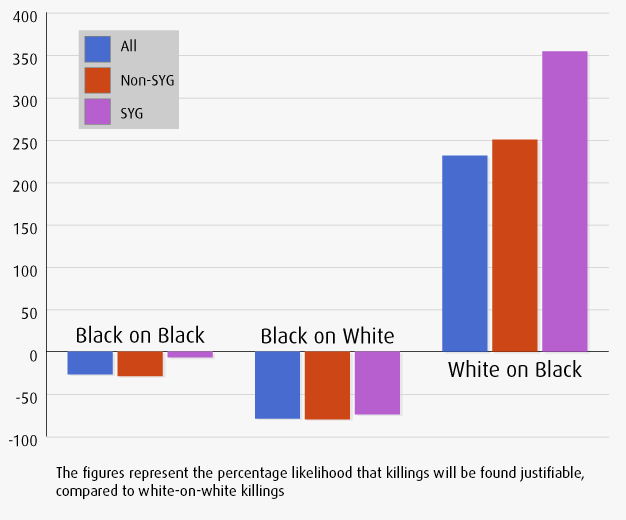
Many thanks for featuring my data. I noted the critiques you highlighted and wondered if I might respond. A reader was concerned that the small number of cases that look like the Zimmerman 11case nullify the analysis. To clarify, the 23 cases are cases where there is a single victim, a single shooter, they are strangers, neither is law enforcement, a handgun was used and the shooter was older than the victim. It’s not a sample of those kinds of cases – it’s every single one in the five years of FBI data. To generate the data in the chart, I ran a regression model, which includes about 5,000 other cases that did not share all of those attributes, so the overall sample is about 5,000, not 23, which is great for a social science dataset. There is no data about income in the dataset and unfortunately nothing about the setting where the shooting occurred (residence, business, street), but I controlled for everything else available.

The bottom-line is, I would have preferred to have conducted the data analysis your readers were looking for, but those data simply are not available anywhere. And I agree with them that my analysis is not sufficient to make any causal statements.

However, I do note that in a criminal justice system rife with disparities – blacks are disproportionately more likely to be stopped and frisked, to have the cars searched at a traffic stop, to be convicted and to receive longer sentences – this disparity dwarfs them all. So, it’s certainly worth discussing.

Robert VerBruggen joins the discussion:

I saw your post about the Stand Your Ground chart from the Urban Institute, and I just wanted to note a few other points I made at RealClearPolicy. Specifically, the overall racial difference (i.e. white-on-black homicides being more likely to be ruled justifiable in all states, SYG or not) might be explained by two factors – one, according to FBI data, black/white violent crimes are more likely to involve black offenders and white victims, so whites are presented with more opportunities to commit justifiable homicides against blacks than vice versa; and two, whites are more likely to own guns, so they’re more likely to have the means to commit justifiable homicide when they have the opportunity.

Chart Of The Day

Screen Shot 2013-07-16 at 15.15.22

Mark Lee illustrates the increase of Hollywood movies portraying government in a negative light, linking it with Americans’ rising distrust of Washington in the real world:

The theory is that, in the years since 9/11, America has grown increasing disillusioned with its government due to its repeated shortcomings–Afghanistan, Iraq, Hurricane Katrina, the Great Recession, Congressional gridlock–and that Hollywood movies have reflected this disillusionment with more and more stories that involve rogue heroes operating outside of, or in some cases, directly against, the authority of the US government.

Both of these trends feel right on a gut level. Who among us isn’t more cynical and distrusting of the United States government now, compared to 12 years ago? And doesn’t Independence Day, in which the US government unequivocally saves the day, feel dated and corny compared to movies like The Dark Knight Rises and The Avengers, in which non-state actors rise above the pettiness of governments to get the job done?

Recent Dish on the appeal of anti-government cinema here.

Chart Of The Day

World Population

Africa’s population is projected to skyrocket:

Right now, with a couple of exceptions, Africa’s population density is relatively low; it’s a very big continent more sparsely populated than, say, Europe or East Asia. That’s changing very quickly. The continent’s overall population is expected to more than quadruple over just 90 years, an astonishingly rapid growth that will make Africa more important than ever. And it’s not just that there will four times the workforce, four times the resource burden, four times as many voters. The rapid growth itself will likely transform issues within African countries and thus their relationship with the rest of the world.

Nigeria is expected to become one of the world’s largest countries:

In just 100 years, maybe two or three generations, the population is expected to increase by a mind-boggling factor of eight. The country is already troubled by corruption, poverty and religious conflict. It’s difficult to imagine how a government that can barely serve its population right now will respond when the demand on resources, social services, schools and roads increases by a factor of eight. Still, if they pull it off – the country’s vast oil reserves could certainly help – the rapidly growing workforce could theoretically deliver an African miracle akin to, say, China’s.

Chart Of The Week

A reader writes:

I’m surprised that you repeatedly posted that chart about the Stand Your Ground results compared to white-on-white incidents without attribution. It’s a great chart, and the difference so stark, that it begs for attribution.

We subsequently updated the posts with a link to the study – by John Roman of the Urban Institute’s Justice Policy Center, via PBS’s Frontline, which followed up with Roman to create the chart. Another reader picked up on Roman’s study:

I was amazed by the graph you’ve posted several times this week regarding percentages 11of justifiable homicides between the races.  It was troubling enough that I decided to track down the source of the study.  In doing so, I found out an even more amazing statistic.  The study looked at all 73,000 homicides between 2005-2009.  It then separated all of the homicides where one stranger killed another stranger, similar to what occurred in the Trayvon case.  Finally, the study separated those instances by race.  Of the 73,000 homicides in that time period, only 23 were one white person killing one black person.  23!  From the media coverage this weekend, I thought the number was probably in the thousands.  The small sample size makes the significant portion of the graphic you posted basically worthless.

I don’t think it makes the chart worthless. But it’s an important piece of perspective. Update from a reader:

The reader is fundamentally confused on the difference between a random sample survey and a census or direct reporting of observed data.  For a survey, you need to reach a certain number of responses/cases randomly selected from the total universe of potential respondents or cases to achieve statistical validity.  But if you’re reporting the actual, total data for a universe of observed people or phenomena, there’s no “sample size” involved – you’re reporting the facts.

Another critique:

Income is absent from this chart. Did it occur to you that perhaps the white people were wealthier and had better lawyers? Maybe the amount paid for lawyers correlates to the efficacy of those lawyers? (It stands to reason that lawyers that can charge more get their way more often; why would anyone pay more for them if that weren’t true?) In fact, nationally, white men earn 150% of what black men earn.

Another builds on that point:

Look at OJ – a rich black guy was able to kill two white people and get away with it, even with what looked like a very good case.  How? MONEY – he had a lot of it and bought the best lawyers he could to buy his freedom.  I suspect many of the white dudes in the chart that beat their case because of their ability to put up a vigorous defense, or at least threaten to do so. So the chart does show that SYG makes it easier to beat a murder charge, but it doesn’t show that whites (or Hispanics) are getting away with murder with a sly wink of a racist society.  I’d also like to see more detail from the chart as well, such as the location and situation of the relative incidents.  It’s possible that there are a lot of other factors involved.

Chart Of The Day

arctic-death-spiral-1979-201303

Joe Romm looks ahead to the future implied by Andy Haveland-Robinson’s “death spiral” chart of Arctic Ocean ice coverage over time:

If recent volume trends continue, many experts say we will see a “near ice-free Arctic in summer” within a decade. Recent research finds that may well usher in a permanent change toward extreme, prolonged weather events “such as drought, flooding, cold spells and heat waves.

Chart Of The Day

Brian Merchant unpacks it:

The useful thing about this graph, though, is that we’re then treated to a window of how these carbon sources are tied to crucial industrial and social functions, and how closely interlinked and therefore how massively difficult to unlink they are. As David Roberts notes at Grist, “Industry uses coal for high-heat operations like coking for steel production and it’s difficult to replace that kind of thing with electricity.” That’s a tough one indeed.

The vast majority of our oil is pumped directly into the vast majority of our cars, and that’s another 15% of the problem. Energy-guzzling residences and commercial buildings are another 20%.

And, as you can see here a full third of global warming is caused by “direct” emissions—methane emitted by agriculture and waste degradation, and our nasty habit of chopping forests down, which releases the CO2 they were storing before we ship them off to Home Depot.

Chart Of The Day

Opinion Immigration

YouGov compares public opinion on immigration from 2010 and 2013:

[I]n 2010, Republicans overwhelmingly opposed opening up a pathway to citizenship; now, perhaps worried about their party’s weakness with Hispanic voters in recent elections, they divide evenly. Those in the West are among the most likely to say that immigration is a serious problem in their community (and 27% admit they know someone in this country illegally); they support this kind of path to citizenship 53% to 32%.

Know hope.

Chart Of The Day

James Plunket passes along what he calls “the scariest chart in the world right now”:

European Youth Unemployment

Derek Thompson comments:

Youth unemployment is bad for all the obvious reasons, including the big loss to future productivity and earnings. But Europe’s youth unemployment is strange, because we’ve never seen a generation *this educated* also be this unemployed. Nearly 40 percent of Spain’s 20-and early-30-somethings are college educated. In Greece, it’s 30 percent. Europe’s crisis — clearly worsened by its austerity obsession — is an absurd waste of the most educated generation in the continent’s history.

Chart Of The Day

Jobs Gap

Derek Thompson flags a new survey that “finds that the wage gap nearly evaporates when you control for occupation and experience among the most common jobs, especially among less experienced workers”:

Comparing men and women job-by-job conceals the fact that men still dominate many of the highest-paying jobs. PayScale studied more than 120 occupation categories, from “machinist” to “dietician.” Nine of the ten lowest-paying jobs (e.g.: child-care worker, library assistant) were disproportionately female. Nine of the ten highest-paying jobs (e.g.: software architect, psychiatrist) were majority male. Nurse anesthetist was the best-paid position held mostly by women; but an estimated 69 percent of better-paid anesthesiologists were male.

Chart Of The Day

Screen shot 2013-05-24 at 11.49.14 AM

It’s the result of the latest annual Country Ratings Poll for the BBC World Service. Britain has been buoyed by the Olympics; China and India have sunk; Germany has also seen gains in approval, even in France! And then you notice the group of countries Greater Israel is now lumped in with: North Korea, Iran and Pakistan. Good going, Netanyahu! Just keep building those settlements.