Chart Of The Day

6a00d83451c45669e2017ee81fe75c970d-550wi

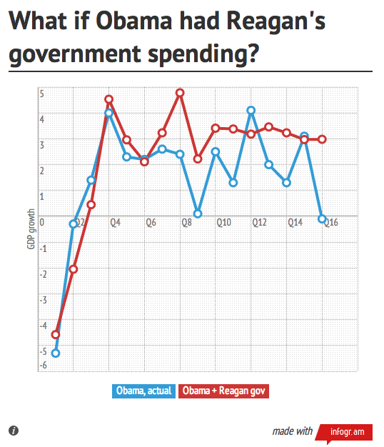
Ezra Klein compares spending under Obama to spending under Reagan and Dubya:

[T]hese graphs simply establish a basic fact about Obama’s term: While deficits have indeed been high, government spending and investment has been falling since 2010. This is, in recent presidential administrations, a simply unprecedented response to a recession. Just for fun, I took Obama’s GDP growth, netted out the effect of government spending and investment, and then added the total government spending and investment numbers — which include state and local government — from Reagan’s first term. The result is a significantly better economy, with growth since 2010 averaging 3.2 percent rather than 2.4 percent.

Chart Of The Day

China’s coal consumption compared to the rest of the world’s:

6a00d83451c45669e2017d409bbced970c-550wi

Plumer wonders whether this trend will last:

Chinese coal use slipped a bit in 2012 as the country’s economy slowed. And the International Energy Agency expects Chinese coal demand to taper off in the coming years, growing at a slower 3.7 percent annual pace between 2011 and 2016. Other projections suggest that China coal use will peak by 2030, as the nation shifts to cleaner forms of energy.

There’s just one catch: India is also growing rapidly and demanding ever more coal. By 2017, the IEA expects India to become the world’s second-largest coal consumer, surpassing the United States.

Chart Of The Day

Derek Thompson welcomes an adjustment in our beverage choices:

Ten years ago, Americans drank enough soda every year to fill a small aquarium. Fifty-three gallons of the stuff per person. That’s half a liter of Diet Coke on an average day. Compare that to our other favorite liquid-caffeine companion. For every cup of coffee we consumed in 2003, we drank two cups of soft drink. For $1 we spent on joe, we spent $4 on soda.

Now look where we are: Soda is in a free fall, with domestic revenue down 40%. Coffee culture is ascendant, up 50% in ten years. In another decade, the United States could easily spend more on coffee than soda — something utterly unthinkable at the turn of the century.

Chart Of The Day

Republican_House

Vote View tracks the Republican lurch to the right:

We have previously written about asymmetric polarization, arguing that the primary driver of contemporary partisan polarization has been the steady movement of congressional Republicans to the right. This trend appears to have continued through the 112th congress. House Republicans – despite a large majority earned in the 2010 midterm elections – have continued their rightward drift, adding more conservative members than moderate members. Senate Republicans also became a more conservative group in the 112th Congress, while Senate Democrats remained mostly ideologically static.

Chart Of The Day

Screen shot 2013-01-01 at 7.46.46 PM

Mark Fischetti offers this chart to those struggling with kicking a bad habit:

"I hate when someone tells me that something is risky," says David Spiegelhalter, a professor of risk assessment at the University of Cambridge. "Well, compared to what?" To answer his own question, Spiegelhalter converted reams of statistical risk tables into a simple metric: a microlife—30 minutes.

(Chart by Jen Christiansen)

Chart Of The Day

State_Abortion_Restrictions

The Guttmacher Institute charts abortion restrictions by year:

Twenty-four of the 43 new abortion restrictions were enacted in just six states. Arizona led the way, enacting seven restrictions; Kansas, Louisiana, Oklahoma, South Dakota and Wisconsin each enacted at least three. Although some of the most high-profile debates occurred around legislation requiring that women seeking an abortion be required to first undergo an ultrasound or imposing strict regulations on abortion providers, most of the new restrictions enacted in 2012 concerned limits on later abortion, coverage in health exchanges or medication abortion.

Sarah Kliff adds:

There is one type of law that seems to be moving in the opposite direction: Barring abortion providers like Planned Parenthood from receiving state family planning dollars. Seven states passed laws like that in 2011, a number that dropped to two states in 2012.

Chart Of The Day

Ad_Revenues

The above chart is from the Interactive Advertising Bureau's October 2012 report (pdf) on internet advertising revenue. What it shows:

Online advertising continues to remain concentrated with the 10 leading ad-selling companies, which accounted for 73% of total revenues in Q2 2012, up slightly from the 72% reported in Q2 2011. Companies ranked 11th to 25th accounted for 9% of revenues in Q2 2012, consistent with the 9% reported in Q2 2011. Companies ranked 26th to 50th accounted for 8% in Q2 2012, also consistent with the 8% in Q2 2011.

Chart Of The Day

Fiscal_Cliff_Taxes

Matthew O'Brien breaks down the fiscal cliff's tax hikes:

If all of the tax cuts, credits, and deductions set to expire at year end do in fact expire, incomes will fall off a tax cliff. Median earners will have 4 percent less in take-home pay in 2013 than they otherwise would; households making a million dollars or more would have 11.4 percent less.

Chart Of The Day

Ereading_Ownership

Ingrid Lunden goes over a new e-reading report:

According to Pew’s ongoing Internet & American Life survey, 25% of respondents — one in every four — now owns a tablet; while e-reader ownership is now at 19%. Biggest of all is the fact that now one in every three people owns some kind of device — tablet, e-reader or both — for e-reading. That’s more than a twofold rise for tablets over December 2011, when tablets and e-readers were level, with 10% of surveyed respondents said they owned one or the other. This most recent survey dates from November 2012 — meaning that the proportion is likely to rise even further after holiday sales shopping is taken into account.

Chart Of The Day

Never events 1

Sarah Kliff explains:

They sound like some of the worst mistakes a surgeon could make: Leaving an instrument inside a patient. Operating on the wrong body part — or the wrong person. They’re aptly named "never" events, the errors that should never, ever occur. Turns out, however, these "never" events happen quite frequently, about 500 times a year. Between September 1990 and September 2010, new research in the journal Surgery found evidence of 9,744 paid malpractice claims for never events.