Chart Of The Day

The financial footprints of various gun groups:

Gun_Groups

Cillizza comments:

For you non math-majors out there, the NRA alone spent roughly $240 million more than the Brady Center to Prevent Gun Violence, the biggest-spending gun control group. That means the Brady Center’s spending amounts to approximately one percent of the NRA’s spending in 2010.

(Chart by City Limits)

Chart Of The Day

Gun_Ownership_Rates

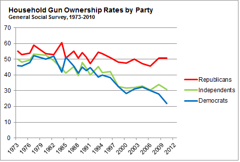
Nate Silver breaks down gun ownership by political affiliation:

In 1973, about 55 percent of Republicans reported having a gun in their household against 45 percent of Democrats, according to the General Social Survey, a biennial poll of American adults. Gun ownership has declined over the past 40 years — but almost all the decrease has come from Democrats. By 2010, according to the General Social Survey, the gun ownership rate among adults that identified as Democratic had fallen to 22 percent. But it remained at about 50 percent among Republican adults.

He writes that demographic data "suggest that gun ownership will continue to decline among Democrats while holding steady among Republicans, further increasing the partisan gap." Relatedly, Enten takes a closer look at Democrats' gun control views:

Those in favor of fewer gun restrictions are winning the battle because they are breaking into demographic groups that normally vote Democratic. Romney took only 36% of the vote in urban areas, but 46% of urbanites were for minor or no gun restrictions. More tellingly, Romney took only 18% of the vote among non-whites, but 32% of non-whites were for minor or no gun restrictions. This finding is confirmed in an April Pew poll. So, Democrats also have to reckon with a base that isn't as anti-gun as you might think.

Chart Of The Day

Gun_ownership_rate

Max Fisher posts a chart showing "the 10 countries with the highest per capita gun ownership rates in the world":

It’s a pretty motley bunch. Recent war zones such as Yemen, Serbia, and Iraq are on there, but so are relatively developed (and peaceful) Switzerland, Finland, and Sweden. The fact that Swiss gun murder rates are much lower than Iraq’s are a reminder that, yes, there is a lot more to determining a national rate of gun-related homicides than just firearm ownership. Still, as we saw in a previous post, Switzerland also has an unusually high rate of gun-related murders. It’s not as high as America’s, but then again neither is their gun ownership rate.

Ezra Klein talks to Janet Rosenbaum about Switzerland and Israel, two countries with high gun ownership often compared to the US. Rosenbaum:

Both countries require you to have a reason to have a gun. There isn’t this idea that you have a right to a gun. You need a reason. And then you need to go back to the permitting authority every six months or so to assure them the reason is still valid. The second thing is that there’s this widespread misunderstanding that Israel and Switzerland promote gun ownership. They don’t. Ten years ago, when Israel had the outbreak of violence, there was an expansion of gun ownership, but only to people above a certain rank in the military. There was no sense that having ordinary citizens [carry guns] would make anything safer.

Chart Of The Day

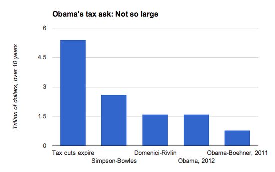
Ezra Klein puts Obama's proposed tax increases in perspective:

Obama_Taxes

Ezra's read on the executive branch:

The truth is, the White House wants a deficit deal for many reasons. They believe deficits are a problem. They want to move onto priorities like immigration reform. They’re committed to securing more stimulus. They think the fiscal cliff and the debt ceiling could do enormous damage to the economy. They think the American people want compromise. They think that a major deficit-reduction deal will be crucial to Obama’s legacy.

Chart Of The Day

Life_Expectacy

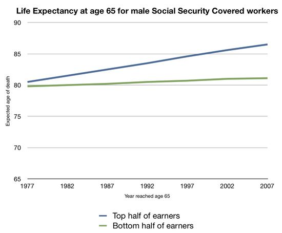
Raising the Medicare eligibility age is being discussed as part of the fiscal cliff negotiations. Aaron Carroll uses the above chart to argue against the idea:

What you’re seeing is life expectancy at age 65 broken out in to the top half of earners and the bottom half of earners, from 1977 to 2007. I got these data from a study that appeared in Social Security Bulletin in 2007. The paper was entitled, “Trends in Mortality Differentials and Life Expectancy for Male Social Security–Covered Workers, by Socioeconomic Status.” We know that average life expectancy went up less than 5 years overall in this period. But what’s somewhat stunning is how much of a disparity there is in these gains. The top half of earners gained more than 5 years of life at age 65. The bottom half of earners, though, gained less than a year.

If you raise the age of eligibility by two years, then you are taking away more years of Medicare than half the country gained in longer life. Moreover, we’ve already taken away these people’s Social Security. The Greenspan Commission in the early 1980s made it so that the retirement age is already 66. It’s scheduled to rise to 67. So those at the bottom half of the socioeconomic ladder have already lost more years of Social Security than they’ve gained in years of life expectancy at 65.

Chart Of The Day

Screen Shot 2012 12 05 at 2 28 56 PM

Tim Iacono explains what's driving rising home prices, which are now up 6 percent year-on-year:

While there are clearly other factors involved, it is the Federal Reserve’s asset purchase program that is largely responsible for … freakishly low rates (it is one of their stated policy objectives)…. As shown above, even if mortgage rates moved back up to their 20-year average rate of 6.5 percent (what many thought were simply unbelievable rates when they first dropped that low last decade), that same $1,100 mortgage payment would finance a home purchase of just $193,000, not the current $279,000.

Why sliding interest rates should worry us, he says:

This is starting to sound a lot like those 2005-era stories of people with $50,000 incomes buying $500,000 houses. How you end up there is much different (liar loans and interest-only loans versus super-low mortgage rates), but the underlying instability that this sort of financing creates is not all that different.

(Hat tip: Barry Ritholtz)

Chart Of The Day

Screen Shot 2012 12 04 at 10 49 30 AM The Economist extracts the good news from the Institute for Economics and Peace’s newly released global terrorism index:

[W]hile the number of incidents there have climbed since 2007, deaths have actually declined…. If there is any small cause for comfort, it is that terrorist incidents have plateaued since their peak in 2008.

Though terrorist attacks are surprisingly widespread – only 31 out of 158 countries surveyed have not experienced any since 2002 – Iraq has fared the worst:

Iraq ranks first based on a five-year weighted average of the number of incidents, deaths, injuries and estimated property damage. It has suffered from the most attacks, including 11 of the world’s worst 20. Indeed, Iraqis comprised one third of deaths from terrorism between 2002 and 2011…. Other terrorist hotspots include Pakistan, Afghanistan and India. The worst attack over the period was in Nepal, where 518 people died and 216 were injured.

It’s worth recalling that the US was formally responsible for the security of Iraqis for almost this entire period. Which is to say that George W. Bush unleashed a wave of terrorism far more devastating to human life than in any other country. I wonder if he or Rumsfeld or Cheney ever examine their consciences on that. When incompetence means just loss of money, it’s one thing; when it means the deaths of tens of thousands, it’s quite another.
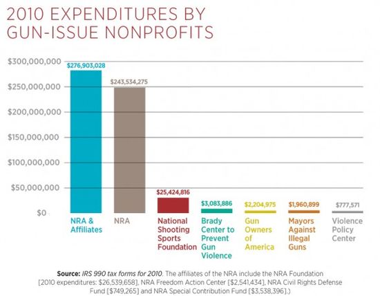
Chart Of The Day

Screen shot 2012-11-30 at 1.43.49 PM

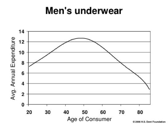
How does spending change over a lifetime? Sam Ro investigates:

HS Dent, an economic forecasting firm, compiled Census data on spending behavior and presented them as a series of demand curves. The curves measure average annual expenditure for a given product over the age of the consumer. … What are some things we learned? Well, men spend less on underwear as they get old, but spending on robes spike near the end of life. As we get older we use a lot less plastic cutlery. And alcohol consumption stays pretty steady from the day we turn 21 until we turn around 70.

Chart Of The Day

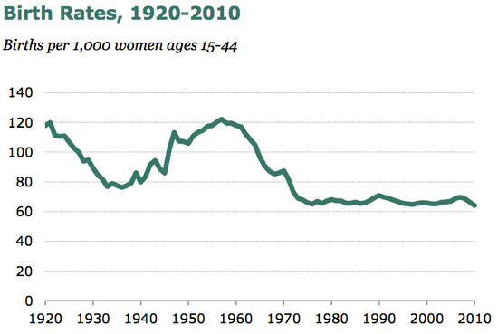
The US birthrate has hit a new low:

Birth_Rate

Ezra Klein captions:

A key contradiction in American public opinion is that many people simultaneously think that immigration is bad for the economy (“they’re taking our jobs!”) and that a low birthrate is bad for the economy. But they basically lead to the same economic problem: too many old people, not enough young people. The United States is lucky in that much of the world — including many people with lots of skills — wants to come here. The fact that our birthrate is dropping only strengthens the case for letting them in.