Chart Of The Day II

Obamacare Enrollment

Cohn discovers that the latest Obamacare enrollment data is being misreported:

The facts are right but the interpretation is not. The months HHS has been using for tabulation don’t correspond precisely to the calendar, because of state reporting methods and where weekends fall. As it turns out, “February” is actually February 2 through March 1. That’s 28 days. “January” is actually December 29 through February 1. That’s 35 days. Plug in the numbers, and you’ll see the average daily enrollment for January was 32,744 and for February it was 33,673. As you can see in the graph, the pace actually increased a bit. Among the very few who noticed were Charles Gaba of ACASingups.net and Sy Mukherjee of ThinkProgress.

Chart Of The Day

public_v_ir_scholars

A reader writes:

I’ve been closely following your thread on “Right-Sizing the Military” and I thought you might be interested in a poll of International Relations scholars in the U.S. that my colleagues and I recently conducted. Our goal was to see what folks who study these issues for a living think about the proposed defense budget. (We also asked about a variety of issues Russia, Ukraine, and Syria.) We heard back from 900 IR scholars (out of a approximately 2,800 in the U.S.). Those who responded were statistically indistinguishable from those who did not. The margin of error is +/- 2.7 percent.

With regard to the defense budget, 75 percent of IR scholars we surveyed said we spend too much on defense, 20 percent said we spend the right amount, and 6 percent said we spend too little. This contrasts sharply with the public sentiment as recorded by a recent gallup poll (see the attached figure). Further, 27 percent said the proposed Hagel/Obama budget would enhance U.S. security, and 53 percent said it would have no effect.

We’ve published some of the results and a short essay explaining the broader goals of our on-going survey project here.  Our full survey report is in this pdf.  Even more detail on our project is in this one.

Chart Of The Day

Pizza Cost

Quoctrung Bui explains why you should always order the largest pizza:

The math of why bigger pizzas are such a good deal is simple: A pizza is a circle, and the area of a circle increases with the square of the radius. So, for example, a 16-inch pizza is actually four times as big as an 8-inch pizza. And when you look at thousands of pizza prices from around the U.S., you see that you almost always get a much, much better deal when you buy a bigger pizza.

Update from a reader:

As a real New Yorker, I feel it is important to share the information on the other reason to buy the largest pizza you can.

In “real” pizza places (not chains), they pre-make the dough ahead of time and save it out into dough-balls.  When you order your pizza, the pizza maker stretches the dough into the appropriate size for the pan, puts the sauce, cheese and toppings on, and shoves it in the oven.  What he does not do, is say, “hmmm, they have ordered a medium pizza as opposed to the standard large pizza, let me take a portion of this dough off of my dough ball.” What you actually get is a pizza with a tougher, thicker, less-good crust because the dough is the right amount for the standard size pizza.  And the standard sized pizza is a large.

On an unrelated note, I just renewed today.  I upped my renewal from the standard rate ($19.99) to one dollar for every year I have been alive ($42).  I think this will be my go-to going forward.  I was going to just renew, but I found out yesterday I am getting a promotion, so my good fortune is your good fortune.

Damn, now I am hungry for pizza for lunch.

Chart Of The Day

Midterms Local

Cillizza looks at how the midterms might impact state legislators:

It turns out that the six-year itch is even more devastating at the state legislative level, which, as we documented in a post late last week is a critical piece of the political and policy equation for both parties nationally.  Check out this chart, courtesy of the National Conference of State Legislators, to grasp just how daunting the history of second term, midterm elections are for the president’s party at the state legislative level.

Chart Of The Day

Cancer Chart

Chris Kirk passes along an interactive graphic (screenshot above) that shows the prevalence and mortality rates for different types of cancer:

As the chart reflects, breast and prostate cancers are the most common, with 235,000 and 239,000 new cases last year respectively. Fortunately, they are relatively survivable cancers, though their mortality rates more than double by the 20-year mark. Pancreatic cancer is the most deadly, killing 96 percent of patients within five years. That’s partly because pancreatic cancer typically does not cause symptoms until it’s at a late stage of progression. For the same reason, liver cancer is the second-deadliest cancer, killing 93 percent of patients within five years.

The original graphic comes from David Taylor, who runs a data-visualization blog. Interactive version here.

Chart Of The Day

College Costs

Shaila Dewan passes along the latest from (pdf) Pew:

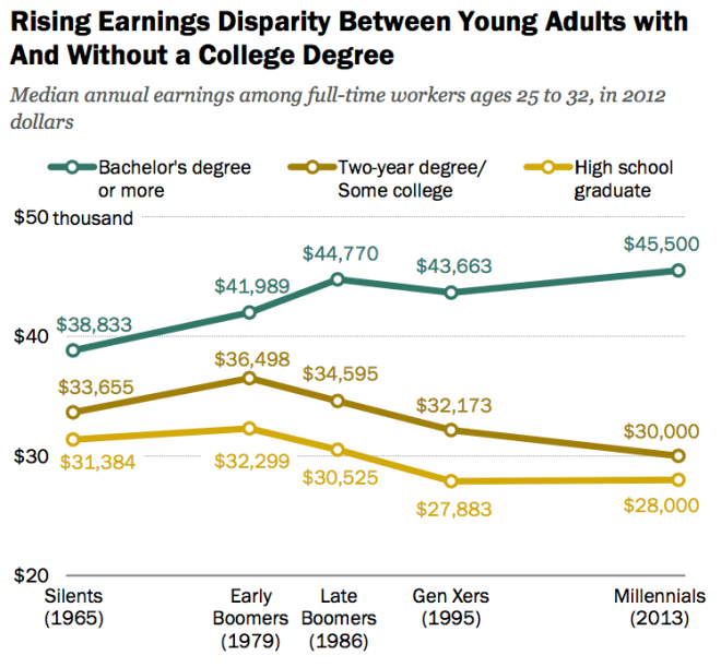
From 1965 to 2013, according to a new Pew report called “The Rising Cost of Not Going to College,” the typical high school graduate’s earnings fell more than 10 percent, after inflation.

“That is one of the great economic stories of our era, which you could define as income inequality,” said Paul Taylor, an author of the report. “The leading suspects are the digital economy and the globalization of labor markets. Both of them place a higher premium on the knowledge-based part of the work force and have the effect of drying up the opportunities for good middle-class jobs, particularly for those that don’t have an education.”

Even middle-class jobs that are still available increasingly require a college degree, either because they require more skill than they used to or because employers have become pickier.

Laurence Steinberg believes fixing high school is the best way to produce more college graduates:

The U.S. has one of the highest rates of college entry in the industrialized world. Yet it is tied for last in the rate of college completion.

More than one-third of U.S. students who enter a full-time, two-year college program drop out just after one year, as do about one fifth of students who enter a four-year college. In other words, getting our adolescents to go to college isn’t the issue. It’s getting them to graduate.

If this is what we hope to accomplish, we need to rethink high school in America. … If we want our teenagers to thrive, we need to help them develop the non-cognitive traits it takes to complete a college degree—traits like determination, self-control, and grit. This means classes that really challenge students to work hard—something that fewer than one in six high school students report experiencing, according to Diploma to Nowhere, a 2008 report published by Strong American Schools. Unfortunately, our high schools demand so little of students that these essential capacities aren’t nurtured. As a consequence, many high school graduates, even those who have acquired the necessary academic skills to pursue college coursework, lack the wherewithal to persevere in college. Making college more affordable will not fix this problem, though we should do that too.

Chart Of The Day

Obamacare Coverage

Jonathan Cohn puts Obamacare’s partial coverage of the uninsured in perspective:

Liberals settled on something like Obamacare, which they realize will reach only about half of the uninsured for now, because they had literally spent decades trying to do something more ambitious—only to fail, thanks in no small part to conservative opposition. And while conservatives like to say they have better ideas for reforming health care, their proposals inevitably result in many fewer people getting coverage—or those getting coverage getting significantly less financial protection.

Recent Dish on who Obamacare does and doesn’t cover here.

Chart Of The Day

iraq casualties

Anup Kaphle checks in on Iraq:

You can see that violence has spiked considerably since the war’s formal end and the withdrawal of U.S. combat troops.

Last month, 992 people were killed in Iraq, according to numbers recorded by AFP, as the country struggles to contain deadly attacks by Sunni militants. Iraqi ministries of health and defense put the death toll even higher, saying that at least 1,013 people were killed in January, including 795 civilians, 122 soldiers and 96 policemen.

That makes January the deadliest month for Iraq since April 2008, when nearly 1,100 people were killed as the country was still rising from the ashes of a brutal sectarian war.

Chart Of The Day

Combat Experiences

Mark Thompson looks at the relationship between combat experience and mental health problems:

After years of debating to what degree repeated deployments and other factors play a role in post-traumatic stress and traumatic brain injuries—and the anxiety, depression and suicidal tendencies they can trigger—this chart indicates that it is the number of combat events, more than the time deployed, that drives up mental-health problems (of course, the two tend to travel together, but not always).

The U.S. military has been plagued by epidemics of mental-health problems since the wars in Afghanistan and Iraq began. The graphic shows that while troops can withstand several of what the Army calls “combat experiences,” their mental armor begins breaking down once they experience 10 or more such events.

Chart Of The Day

NFL Facebook

Noah Chestnut explains what you’ll be feeling tonight:

Throughout the 2013-2014 NFL season, Facebook data scientists anonymously tracked messages posted by millions of football fans in order to measure their minute-by minute emotional reactions during a game. Football fans wind up following a predictable pattern: excitement before the opening kickoff and then frustration, anxiety, anger and depression set in for almost 2 hours until the winning team’s fans start to experience relief and joy.