Odra Noel’s “Map of Health,” on display at the Royal Society’s Summer Science Exhibition in London, illustrates the diseased tissues that most affect each part of the world:
Robert Gonzalez calls the piece “a weirdly beautiful combination of epidemiology and microscopy”:
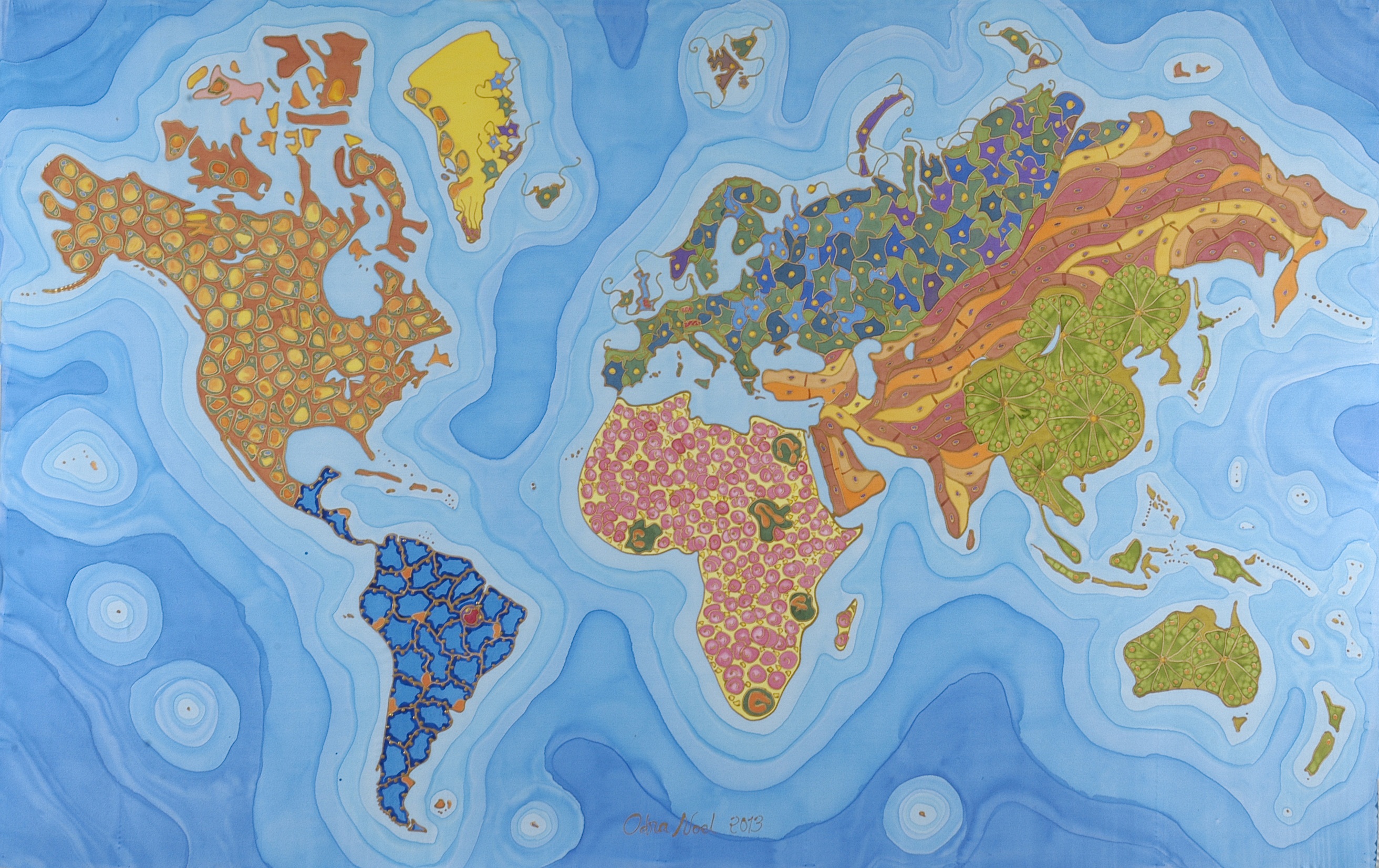
North America, plagued by its obesity epidemic, is depicted as adipose tissue (fat). Central and South America are represented with pulmonary tissue, reflecting the lethal impact of smoking and respiratory illness in the region. Europe and Russia, their aging populations more susceptible to neurodegenerative diseases, are depicted with brain tissue; East Asia and the Pacific are represented with pancreatic tissue, which is affected keenly by diabetes. Much of the Middle East and central Asia, where cardiovascular diseases are on the rise, are painted with microscopic representations of heart muscle. Africa, where transmittable infections like malaria and HIV pose enormous challenges to public health, is depicted with blood cells. All data was taken from statistics gathered by the World Health Organization.
More here.
