Map Of The Day

This embed is invalid


Megan Gambino unearths the first map to bear the name “New England,” published by Captain John Smith in 1616:

In his new book, A Man Most Driven: Captain John Smith, Pocahontas and the Founding of America, [Peter] Firstbrook argues that historians have largely underestimated Smith’s contribution to New England. While scholars focus on his saving Jamestown in its first two harsh winters and being saved by Pocahontas, they perhaps haven’t given him the credit he deserves for passionately promoting the settlement of the northeast. After establishing and leading the Virginia Colony from 1607 to 1609, Smith returned to London, where he gathered notes from his exploration of the Chesapeake Bay and published his 1612 map of Virginia. He yearned for another adventure in America and finally returned in 1614.

When Smith was mapping New England, the English, French, Spanish and Dutch had settled in North America. Each of these European powers could have expanded, ultimately making the continent a conglomerate of similarly sized colonies. But, by the 1630s, after Plymouth and the Massachusetts Bay Colony were established, the English dominated the East Coast—in large part, Firstbrook claims, because of Smith’s map, book and his ardent endorsement of New England back in Britain. “Were it not for his authentic representation of what the region was like, I don’t think it would be anywhere near as popular,” says Firstbrook. “He was the most important person in terms of making North America part of the English speaking world.”

Map Of The Day

Car_bombings_Screen_Shot_2014-10-17_at_3.37.19_PM.0

Amanda Taub highlights the work data journos at The Guardian have been doing with Wikileaks’ Iraq War logs. Each red dot on the above map – the screenshot seen above only shows one corner of Baghdad, but the project covers the whole country – represents one of some 60,000 combat-related fatal incidents (mostly IEDs) between 2004 and 2009, representing more than 100,000 deaths. And that’s not even the whole story, as Taub points out:

[T]he true extent of the violence is much worse: the map likely only shows a small fraction of the attacks from that period. The database the map is drawn from does not include deaths from criminal activity, or those that were initiated by Coalition or Iraqi forces. And many deaths may not have been officially tallied. That means that the real total is almost certainly much higher. But even seeing the number of attacks recorded here shows how devastating this war has been to Baghdad’s civilians, who must now face even more attacks.

Map Of The Day

by Dish Staff

Screen Shot 2014-09-03 at 1.51.35 PM

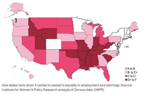
Niraj Chokshi illustrates how the best states for female workers are in the Northeast:

Massachusetts had the highest score [for women’s earnings and employment] among states, according to the analysis of four factors conducted by the Institute for Women’s Policy Research. (D.C. scored even higher, though many argue it is better compared to other cities.) All but four of the 10 highest-scoring states – Maryland, Minnesota, Colorado and Virginia – were in the Northeast. Sixteen states earned a B- or higher. West Virginia ranked dead last and, along with Alabama, received an F. The composite scores, excluding D.C., ranged from 68.5 to 90.5, on a hundred-point scale.

The four factors analyzed to develop the composite scores were: median annual earnings (for full-time, year-round women workers); the earnings ratio between men and women (again, for full-time, year-round women workers); the share of women in the workforce; and the share of women in managerial or professional jobs.

Map Of The Day

by Dish Staff

School Demographics

Reed Jordan spotlights our schools’ racial segregation:

Despite our country’s growing diversity, our public schools provide little contact between white students and students of color. We’ve mapped data about the racial composition of U.S. public schools to shed light on today’s patterns at the county level. These maps show that America’s public schools are highly segregated by race and income, with the declining share of white students typically concentrated in schools with other white students and the growing share of Latino students concentrated into low-income public schools with other students of color.

In every state but New Mexico and Hawaii, the average white student attends a school that is majority white. This is unsurprising for large swaths of the Northwest, Great Plains, Upper Midwest and Northeast, which are home to very few kids of color. But even in diverse states like Illinois, Michigan, Pennsylvania and New York, few white children attend diverse schools.

Map Of The Day

by Dish Staff

UcQkq0b

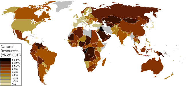
Yglesias digs up a creation by Redditor nonmetuammori that maps out, based on World Bank data, how much the economies of different countries depend on natural resources. Matt comments:

The news that, say, Saudi Arabia depends heavily on its oil wealth probably won’t shock you. What really jumps out here, however, is that most of the people who live in countries that have a low resource contribution to GDP live in rich countries (the USA, Japan, Germany, France) not in countries that lack natural resources. Places like Canada and Australia that have high incomes and resource-dependent economies take up a fair amount of space on the map but they have very little population density. There are more people in Italy than in Australia and Canada combined.

Map Of The Day

opSPO1O

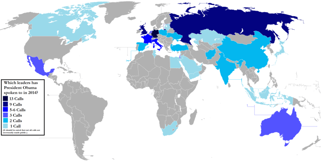
Every phone call Obama has made to another world leader so far this year. Max Fisher captions:

The most significant detail here is Europe: Obama’s phone calls in 2014 have been overwhelmingly with European leaders. This just goes to show how much the Ukraine crisis has come to dominate US foreign policy this year. Tellingly, the foreign leader whom Obama has called most frequently is, by far, German Chancellor Angela Merkel. That may surprise you — US-German relations are probably not the first topic that comes to mind when you think about US foreign policy — but it makes sense given the Ukraine crisis. The German leader is the most influential figure within the European Union, and the EU is the body with the most power to help Ukraine and to punish Russia for its role in the crisis.

Map Of The Day

Alison Abbott explains the genesis of the above video, which depicts 2,600 years of cultural change:

Maximilian Schich, an art historian at the University of Texas at Dallas, and his colleagues used the Google-owned knowledge base, Freebase, to find 120,000 individuals who were notable enough in their life-times that the dates and locations of their births and deaths were recorded. The list includes people ranging from Solon, the Greek lawmaker and poet, who was born in 637 bc in Athens, and died in 557 bc in Cyprus, to Jett Travolta – son of the actor John Travolta – who was born in 1992 in Los Angeles, California, and died in 2009 in the Bahamas.

The team used those data to create a movie that starts in 600 BC and ends in 2012. Each person’s birth place appears on a map of the world as a blue dot and their death as a red dot. The result is a way to visualize cultural history – as a city becomes more important, more notable people die there.

Mark Byrnes cautions:

Of course, devoting such a study to only ‘notable individuals’ of Europe and North America leaves out all sorts of people; most people, in fact.

The visualization of North American migration, for example, suggests the continent was uninhabited until Colonial times. The reason for the omission of so many kinds of people is quite simple: “[t]he poor are simply not as well recorded,” one of the researchers, Maximillian Schich, an asso­ciate pro­fessor in arts and tech­nology at the Uni­ver­sity of Texas at Dallas, tells National Geographic.

What we see in these videos is an example of how powerful data visualizations can be. But when it comes to charting thousands of years of world history, they’re still only as good as the records researchers can access.

Eliza Berman adds:

The video and accompanying article, which appear in Nature, an international science journal, have generated some criticism on Twitter, since Nature fails to qualify the phrase “visual history of human culture” with the words “Western” or “European.” Still others question how much the places where a man—and these are mostly men—was born and died can really tell us about cultural history.

These critiques are valid, and perhaps they’ll be addressed as Schich’s team releases further research. But if we take the video for what it is and nothing more—a mesmerizing view of the migrations of people whose contributions Western culture values—it’s a compelling look at the interplay between culture and geography.

Map Of The Day

twitter-media-israeli-palestine-map

Gideon Lichfield captions the above image, which “depicts Twitter accounts that tweeted about the Israeli shelling of a UN school in Beit Hanoun on July 24th”:

The Twitter accounts are arranged according to how many connections they share; the closer two accounts are, the more accounts they both follow. The bigger the circle, the more followers that account has. What emerges from this is distinct groupings: “pro-Palestinian” in green on the right; “pro-Israel” in blue on the left. Lotan has colored most of the international journalists and media outlets in gray; they clearly have more followers among the pro-Palestinian side. The dark blue group in the upper left are American conservatives and Tea-Party types, while the lighter blue are Israeli media outlets and blogs, and American Zionist figures.

Map Of The Day

dish_painkillersusa

A new report from the CDC measured prescription painkiller use across the country:

Southern states — particularly Alabama, Tennessee and West Virginia — had the most painkiller prescriptions per person, the report said. For example, in Alabama, there were 143 prescriptions for opioid prescriptions written for every 100 people. That’s about three times the rate seen in Hawaii, which had the lowest rate among U.S. states, with 52 prescriptions per 100 people.

The rate of prescriptions for oxymorphone, one type of opioid painkiller, was about 22 times higher in Tennessee than in Minnesota, which had the lowest rate of prescriptions for that drug, the report said. Prescription rates for long-acting/extended-release painkillers, and for high-dose painkillers, were the highest in the Northeast, particularly in Maine and New Hampshire, the report said.

Such wide variations in prescriptions for painkillers cannot be explained by differences in the health of people in different states — that is, pain-related health issues don’t vary much by region, the CDC said. Rather, the differences may indicate a lack of consensus about when it is appropriate to prescribe painkillers, the report said.