Map Of The Day

by Doug Allen

mainborders

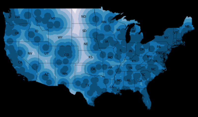
Theoretical physicist Dirk Brockmann used data entered on the dollar-bill tracking site wheresgeorge.com to explore boundaries in the US:

Brockmann took data for how the dollar bills traveled, and used network theory to draw lines where dollar bills are less likely to cross. In places they follow state borders, but not always; Missouri is divided into East and West, as is Pennsylvania. The “Chicago catchment area” includes a big chunk of both Indiana and Wisconsin.

The resulting map shows how “effective communities” don’t necessarily follow state lines. “I don’t know so much about the culture of the U.S.,” says Brockmann, who grew up in Germany. “But when I give talks on this, normally someone in the audience says, ‘Oh, this makes perfect sense.”

Update from a reader:

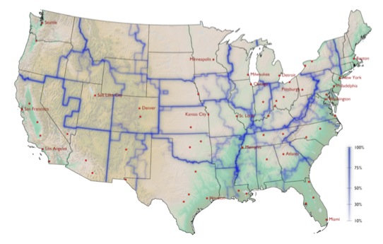
I’d like to point out that the “effective communities” that Mr. Brockmann references in his map may not be as organic as he implies. The boundaries roughly correspond to the districts serviced by the Federal Reserve Banks, which exchange old bills collected by banks for new bills.

(Image from Dirk Brockmann)

Map Of The Day

dog-map

Stephen Reader breaks down a wonderful interactive map of the dogs of NYC:

The most popular ones in the city hew pretty close to the most popular names across all English-speaking countries: Max, Bella, Lucky, etc. But this is New York, so there have to be some named Jeter (40 dogs) and Carmelo (7). In a town also known for its fashion, that explains the prevalence of dogs named Chanel (44), and Dolce (39). There are 83 dogs named Gucci.

The data, from the dog licensing program, also tracks breeds:

Mixed-breed dogs are the most popular, but Yorkies, Shih Tzus, Chihuahuas, and Malteses round out the top five. Nearly 5,000 Yorkies are licensed in the city, and more than 4,700 Shih Tzus. Neighborhood by neighborhood, these are usually the most popular dogs. The East Village doesn’t buck the trend; Yorkies are most popular. But English Bull Dogs seem to be more popular in lower Manhattan, and Pit Bulls are all over Bed Stuy.

Map Of The Day

MotD-0123

Brandon Martin-Anderson composed a zoomable map that shows “every person counted by the 2010 US and 2011 Canadian censuses”:

Why?

I wanted an image of human settlement patterns unmediated by proxies like city boundaries, arterial roads, state lines, &c. Also, it was an interesting challenge.

Get lost in his “Census Dotmap” here.

(Hat tip: Jaymi Heimbuch)

Map Of The Day

abortion-map

Michael Keller and Allison Yarrow mapped the country’s abortion clinics and the distance women in different locations would need to travel to visit one:

The clearest trend on the map is the dearth of clinics through the center of the country—from northern Texas through Kansas, Nebraska, South Dakota, Wyoming, and North Dakota. Roughly 400,000 women of reproductive age (between 15 and 44) live more than 150 miles from the closest clinic in this region. The county farthest away from an abortion clinic is Divide, N.D. All of these states except Wyoming require 24-hour waiting periods between the time a woman schedules an abortion and the procedure.

Interactive version of the map here.