Map Of The Day

NSA_spying_authority

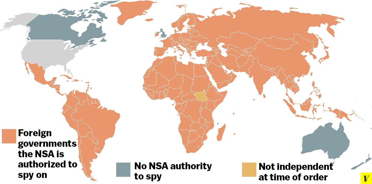
The latest Snowden leak lists the countries where the NSA is allowed to spy, which is to say pretty much everywhere:

Presumably, the NSA preemptively asked for (and got) authority in most of these countries before it had a specific reason. Although, it’s certainly possible that at some point the NSA decided it really needed explicit permission to spy in San Marino, Saint Lucia, the Grenadies, Samoa, Palau, and other island nations that do not present an immediately obvious intelligence draw.

The second thing you’ll notice is the only four nations not included on the list: the United Kingdom, Canada, Australia, and New Zealand. (There is also a fifth, South Sudan, although it was not yet independent as of 2010 and I’d bet everything I own that they’re now on the list.) Those four countries, all fellow Anglophone nations of significant English descent and former members of the British Empire, are members with the United States in an agreement known as 5-Eyes. … But the vast, vast majority of the world is not part of 5-Eyes, and that means that they’re subject to NSA spying on their government, whether they like it or not.

Waldman considers how the rest of the world must be reacting to this news:

I suspect that when most Americans hear that we’re spying on people’s phone and e-mail conversations in almost every country in the world, they think, well, that’s just what we have to do — we’re the United States. As citizens of the global hegemon, we take certain things for granted, like the fact that our soldiers will be stationed in dozens of countries around the globe, or that everyone everywhere should speak English. …

But we should be aware that if you live in another country and you hear that the United States might be reading your e-mails — or that, in what seems to be a test run for later application in other places, the NSA is recording the audio of literally every cellphone conversation in the Bahamas — you’re going to be uncomfortable, to say the least, about the reach of U.S. power. I’m not talking about violent, flag-burning anti-Americanism, but about a far more common feeling, widespread even among people who like American music and movies and share many of our values. It’s the feeling that the United States treats the rest of the world like its subjects, people whose liberties and sometimes even lives can be swept aside whenever we find it in our interest.

Map Of The Day

20131220_overall_us_with_legend

Cohn captions:

Using data from the Centers for Disease Control, [researchers at the Rollins School of Public Health at Emory University, working with Gilead Sciences] developed online, interactive maps depicting where AIDS infections were most prevalent—and where new cases were cropping up most frequently. They called the project AIDSVu. Its principal researcher is Patrick Sullivan, an epidemiologist who worked at the CDC before coming to Emory. … The South has just 37 percent of the country’s population, Sullivan notes. But it has nearly 50 percent of the new HIV diagnoses.

Map Of The Day

Screen_Shot_2014-06-23_at_5.07.38_PM2

Max Fisher captions:

There are only four countries that escaped European colonialism completely. Japan and Korea successfully staved off European domination, in part due to their strength and diplomacy, their isolationist policies, and perhaps their distance. Thailand was spared when the British and French Empires decided to let it remained independent as a buffer between British-controlled Burma and French Indochina. Japan, however, colonized both Korea and Thailand itself during its early-20th-century imperial period.

Then there is Liberia, which European powers spared because the United States backed the Liberian state, which was established in the early 1800s by freed American slaves who had decided to move to Africa. The Liberian project was fraught — the Americans who moved there ruled as a privileged minority, and the US and European powers shipped former slaves there rather than actually account for their enslavement — but it escaped European domination.

Map Of The Day

articseaice

NatGeo is making a major change to its next atlas:

National Geographic’s mapmakers drew their new rendition based on how the Arctic looked in 2012, using sea ice data collected by NASA and NSIDC. While the amount of Arctic ice grows and shrinks throughout the year depending on the season, the Atlas depicts multiyear ice — ice that’s older than an year – in solid white, and the winter’s sea ice maximum is noted with a line drawn around it.

Map Of The Day

screen shot 2014-06-11 at 9.32.30 am

Armin Rosen explains ISIS’s expanding grip on Iraq and Syria:

ISIS operates across a vast geographic area. Jalula, Iraq, the easternmost population center under ISIS’s control, is over 360 miles from Raqqah, Syria, the group’s westernmost zone of control. ISIS sprawls across the Iraqi-Syrian border. It’s attacked inside of Iraqi Kurdistan, sits at the doorstep of Syria’s Alawaite heartland, and has broad operational abilities inside Iraq’s Sunni Triangle, and even its Shi’ite south. ISIS cuts across ethnic and sectarian regions, controlling major cities and desert wilderness.

In analyst Shiraz Maher’s view, ISIS controls more territory than the governments of Israel and Lebanon. It controls nearly a third of Iraq alone, according to the Long War Journal.

And they are far from finished:

Sources told Al Jazeera on Wednesday that gunmen had set up checkpoints around Tikrit, which lies between the capital Baghdad and Mosul, which was [captured] by ISIL [aka ISIS] on Tuesday. “All of Tikrit is in the hands of the militants,” a police colonel told the AFP news agency. A police brigadier general told AFP that fighters attacked from the north,  west and south of the city, and that they were from ISIL. A police major told the agency that the militants had freed about 300 inmates from a prison in the city, the capital of Salaheddin province.

Meanwhile, sources said the nearby city of Kirkuk, home to Iraq’s biggest oil refinery, was also being attacked by ISIL.

Map Of The Day

Screen Shot 2014-06-05 at 10.41.44 AM

Cartographer Kenneth Field was inspired by a U2 song:

The map shows, according to Field, all 3.5 million streets with no name (which are highlighted in gold, à la the album art). … According to the map, Bono should stick to rural areas, while avoiding Vermont and Maine. The Joshua Tree album art was photographed in the Mojave Desert, but if Bono really wanted to show you “a place high on the desert plain …” with lots of unnamed roads, the map suggests that perhaps he should have stuck to the High Plains and Great American Desert of Texas.

See Field’s website here and blog here.

Map Of The Day

3020722-inline-1200scribners-1880-popular-vote1

While flipping through “Scribner’s Statistical Atlas of the United States,” first published in 1883, Susan Schulten marvels at the above map from 1880, “the first American attempt to map the outcome of an election”:

The Popular Vote map was the creation of Henry Gannett, superintendent of the census and future president of the National Geographic Society. It was the first map to use shading techniques to visualise American political behaviour. I was struck by the spatial patterns:

the dense chequerboard of eastern counties contrasting sharply with the open crazy-quilt patchwork out West. Then my eye was drawn to the patterns of colour in the eastern states. Just as now, red and blue were used to show which party had prevailed in each county.

The map even looked a little like the 2012 electoral picture, with a preponderance of blue through what we now regard as the Democratic stronghold of the north-east, and red spilling across the Republican South. It took a minute to see that the colours were reversed: here red represents the Democrats and blue the Republicans. So while the map looks familiar, the political landscape has flipped. … [I]t was not until the election of 2000 that NBC’s “Today” show indelibly fixed the colours of American politics: red for the Republicans and blue for the Democrats.

Update from a reader:

I find it fascinating that Utah is one of the only locations that has completely switched (or didn’t switch, depending how you look at it). It’s an interesting artifact of Mormon history and the change of it’s theology and relationship to American culture.

Map Of The Day

system_1972

A giant of the design world died today:

An avowed modernist, [Massimo] Vignelli is also famous for having said, “If you can design one thing, you can design everything.” And even if you aren’t a design nerd, you’ve been looking at Massimo’s work for decades now, especially if you live or lived in New York: together with his wife Lella, he branded American Airlines, Ford, and Bloomingdales with the logos we know them for today. They also designed Fodor’s travel guides, furniture you’ve probably sat on, and plastic housewares you’ve probably used. The two were recently featured in the documentary Design Is One, which if you can get a hold of, is delightful.

Graphic designer Michael Bierut was a young mentee of Vignelli:

Today there is an entire building in Rochester, New York, dedicated to preserving the Vignelli legacy. But in those days, it seemed to me that the whole city of New York was a permanent Vignelli exhibition. To get to the office, I rode in a subway with Vignelli-designed signage, shared the sidewalk with people holding Vignelli-designed Bloomingdale’s shopping bags, walked by St. Peter’s Church with its Vignelli-designed pipe organ visible through the window. At Vignelli Associates, at 23 years old, I felt I was at the center of the universe.

Joe Cascarelli, quoting from the NYT writeup of Vignelli’s death, provides background on the iconic map seen above:

[W]hen the Metropolitan Transportation Authority released his new subway map in 1972, many riders found it the opposite of understandable.

Rather than represent the subway lines as the spaghetti tangle they are, it showed them as uniform stripes of various colors running straight up and down or across at 45-degree angles — not unlike an engineer’s schematic diagram of the movement of electricity.

What upset many riders even more was that the map ignored much of the city above ground. It reduced the boroughs to white geometric shapes and eliminated many streets, parks and other familiar features of the cityscape.

It was replaced by 1979. “Look what these barbarians have done,” Vignelli said of the map in 2006. “All these curves, all this whispering-in-the-ear of balloons. It’s half-naturalist and half-abstract. It’s a mongrel.”

Examining the 2008 update, he added, “We belong to a culture of balloons. [The designers] grow up with comic books, and this is what happens. There’s balloons all over the place. It’s ridiculous.”

But of his 1972 creation — a “diagram,” he called it, because maps are for geography — Vignelli said, “Of course I know Central Park is rectangular and not square. Of course I know the park is green, and not gray. Who cares? You want to go from Point A to Point B, period. The only thing you are interested in is the spaghetti.”

For more Vignelli quotes, Popova plucked many from interviews he gave to Debbie Millman for her book, How to Think Like a Great Graphic Designeras well as her podcast, Design Matters.

Map Of The Day

by Patrick Appel

Marriage Map

Only one state hasn’t had its marriage ban contested:

Six couples filed a federal lawsuit against South Dakota’s gay marriage ban [yesterday], leaving North Dakota as the only state in the country with an unchallenged same-sex marriage ban. … This is, of course, subject to change, possibly very soon. Josh Newville, the lawyer representing the South Dakota couples, told the AP that he’s been approached by several gay couples from North Dakota and is “seriously considering” taking their case on.

Map Of The Day

by Patrick Appel

Abuse Worldwide

Olga Khazan highlights a report on abuse of women worldwide:

“No place is less safe for a woman than her own home,” reads a World Bank report released [last] week. Roughly 30 percent of the world’s women have experienced physical or sexual violence at the hands of their partners, and across 33 developing countries surveyed by the organization, nearly one-third of women said they could not refuse sex with their partner. …

But the Bank also found that better-educated women were more likely to not be sexually or physically abused. Each additional year of schooling was associated with a 1-percent increase in their ability to refuse sex with their partner.