On Terrible Sentences

Prospero is aghast at a line from Philip Mirowski’s Never Let a Serious Crisis Go to Waste: 

Yet the nightmare cast its shroud in the guise of a contagion of a deer-in-the-headlights paralysis.” That is not just a mixed metaphor; it is meaningless and pretentious at the same time. One would nominate it as the world’s worst-written sentence but it is only the opening clause.

He suggests Mirowski revisit Orwell’s six rules of writing. Linguist Mark Liberman disagrees:

The most obvious problem with Mirowski’s sentence is its unpalatable stew of mixed metaphors: a nightmare is casting a shroud in the guise of a contagion of the sort of paralysis that afflicts a deer caught in the headlights of a car. That’s between four and seven distinct metaphorical systems in 19 words, depending on whether we take cast, guise, and paralysis to have any metaphorical force left. But Orwell’s rule doesn’t tell us not to mix metaphors, it tells us not to use them, or at least not to use metaphors that we’re “used to seeing in print.”

The US-China PR Battle

china-vs-usa

Max Fisher draws up a map comparing America’s and China’s popularity abroad. The contest is most heated in Southeast Asia:

It’s easy to over-exaggerate any competition for global influence between the U.S. and China; Beijing simply doesn’t see itself as a world leader or power in the same way that Washington does. But the diplomatic chess match is more real in Southeast Asia, an increasingly important and resource-rich region that has some historical cause for skepticism of both Chinese and American meddling. If I were in charge of long-term foreign policy planning for either China or the U.S., this is the region where I’d focus the most energy, both because of its importance and because it seems so unusually uncommitted.

In diplomatic terms, China has largely failed to establish greater influence here, often over-playing its hand in a way that Southeast Asian neighbors see as bullying or threatening and a cause for greater reliance on U.S. protection. So it’s interesting to see that this is and is not reflected in the Pew data. The Philippines, a close U.S. military ally and its only former colony, appears as pro-American as ever. But not Malaysia, which, despite an ongoing territorial dispute with China, reports a sky-high 81 percent favorability rating for China.

The Future Of Education Is Experiencing Technical Difficulties

San Jose State University has put its massive open online course (MOOC) project on hold because more than half the students in the pilot program failed their online courses, with pass rates for some classes as low as 20 percent.  George Anders suggests that Silicon Valley philosophies don’t translate well into higher education:

Lots of Silicon Valley startups try to make a virtue out of a hit-and-miss approach to product development. It’s common for software companies, in particular, to bring not-quite-proven ideas to market in a hurry, so they can be rapidly refined or quietly kicked aside as public feedback comes in.

This approach, known as “failing fast,” is admired and celebrated in tech circles, where it’s seen as a way to speed up innovation. But education may turn out to be a fiercer, more unforgiving domain.

After all, major universities have spent decades—even centuries—building their reputations. It’s vital that they be seen as having students’ best interests at heart. It’s unlikely that other schools will want to risk the stumbles of San Jose State’s  pilot program. The likely result: schools will put pressure on MOOC developers to do whatever it takes to succeed slowly, rather than being in a hurry to fail fast.

Will Oremus wonders what will come next:

It’s a sure bet that somehow, at some point, online instruction will indeed reshape higher education, if perhaps in more modest ways than its most ardent backers assume. Missteps are part of the process. Still, this is not the first heavily hyped online-learning venture to make headlines for going dramatically awry. The question is, what university will be eager to offer up its students as the next lab rats in what amounts to a massive pedagogical R&D program by for-profit Silicon Valley startups?

The End Of The Line

fig4_Health_DC_6a

The Robert Wood Johnson Foundation mapped life expectancy by subway public transit stop in five parts of the country (the above map depicts New Orleans), revealing health disparities:

“The maps are meant to show that this is a pervasive problem,” says director of the Virginia Commonwealth University Center on Society and Health, Steve Woolf, whose research has produced a number of similar maps independently. “You can do this in any American city–and many cities have done this and found the same pattern.”

The pattern mimics much of the disparities we see across social and economic inequalities–in areas with less access to educational resources, or decreased availability of safe areas to play or work out, lifespans tend to be shorter. Poverty, the proximity of highways and air filled with diesel fumes, and food deserts are also linked to poor health. Woolf points out that the maps are meant to demonstrate that environmental factors can have a bigger impact on our health outcomes than what happens inside a doctor’s office.

Update from a reader:

Just to be a nitpicky jerk, New Orleans does not have a subway system. We’ve got streetcars for the tourists, and buses for poor people. Also, that’s the least comprehensible map of New Orleans I’ve ever seen. I’ve lived and worked in the city for about 15 years, and I am having a hell of a time telling where those markers actually are. But yeah, the city certainly has a huge variety of economic disparity and no doubt huge amounts of health disparity follow that. Either way, with the huge amount of undoubtedly unhealthy but amazingly delicious food that this town offers; I’m surprised anybody here makes it past 60 before their heart gives up.

Where We Meet Our Mates

Douthat notes that fewer and fewer Americans are marrying fellow churchgoers or neighbors. More and more are meeting online:

[T]he data on unions formed online looks pretty encouraging, and it’s possible that the internet is helping to compensate for the eclipse of other forms of community, rather than contributing directly to those other forms’ eclipse.

But it seems fair to assume that there are still a lot of people who would prefer to meet their future spouse the old fashioned way — through initial flesh-and-blood encounters embedded in a larger pre-existing social network. If that’s your preference, the university campus is one of the few flesh-and-blood arenas that seems to be holding its own as a place to form lasting attachments.

Millman expands on the possible social consequences of widespread online dating:

The hidden costs of internet dating aren’t some much to the romantic “market” as to the rest of society. How many young people don’t go to church or synagogue because there’s no reason to go there to meet marital prospects? And once that dynamic starts, it inevitably accelerates, as the residual group who does show up is increasingly untenable romantically (because they are there for other reasons – or can’t find an “adequate” mate digitally). Then there’s the problem that if you meet someone digitally, you’re probably meeting someone with a distinct social circle – as opposed to someone from within your own social world. That’s good if the relationship doesn’t work out – less risk of collateral damage. But it creates complications if the relationship results in marriage, as now you have two circles to navigate that don’t overlap well. That happens plenty if you meet in meatspace, of course, but it’s much more certain to happen if you meet digitally than if you meet, say, at church.

The South vs Social Mobility, Ctd

Screen Shot 2013-07-22 at 11.20.59 AM

Several readers have voiced skepticism over our coverage of this map and the accompanying piece from the NYT:

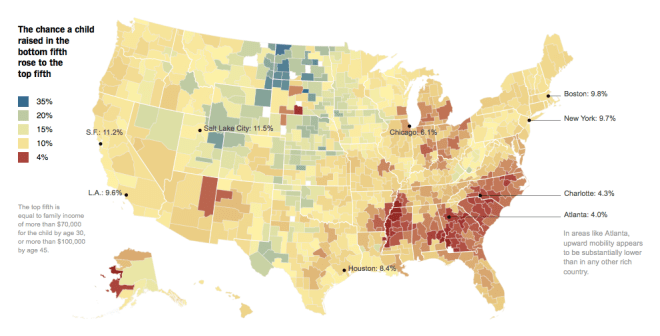
I would be interested to see that map compared to a map of “chances anyone in this county is an earner in the top fifth.” Some parts of the country simply have no or very few opportunities that earn at those levels, so it should be no surprise that you find few people “rise” to that level – with the inverse true for places like NYC, SF and Seattle. To study mobility, unobscured by regional differences in wealth, one would need to re-calibrate to the quintiles within each county, rather than comparing local samples to national averages.

Another reader:

Quite clearly the map shows (and the original paper makes clear) the importance of race, whether that be African-American or Native American. But this does not mean that somehow the Red States only care about taking care of their “white, GOP brethren,” as one reader implied. What does the data (pdf) from the paper say? Check out Table 5. Two of the best negative correlations with intergenerational mobility are the county’s rate of divorce and its share of single moms – two things that disproportionately affect African-Americans and Native Americans.

Utah, meanwhile, confounds your “two Americas” reading. Look at the blue area in Utah in the map you posted. This is because of Mormonism. Check out this blog post, for an interesting discussion on the similarities between Utah and Denmark, two places of high intergenerational mobility.

Another goes into much more detail on the previous points:

The graphs you’re presenting from the New York Times article are HIGHLY misleading.

First off, they look at social mobility without taking into account the regional differences in cost of living. From the chart: “The top 5th is equal to family income of more than $70,000 for the child by age 30, or more than $100,000 by age 45.” Anyone who’s anyone knows that living on $70,000 per year income on the Upper West Side of Manhattan is vastly different than living on $70,000 per year in the rural South.  In one place you are “poor” and the other you can live like a king.  I’ll gladly earn $65,000 and live in Tuscaloosa, Alabama vs. earning $75,000 and living on the Upper West Side of Manhattan. Yet, in one case I haven’t reached the top 5% of income earners while the other I have.  This is clearly not true in reality.

Without a cost of living adjustment, the data is essentially meaningless. Income tells you next to nothing. What you can buy with that income is what matters! And that varies greatly by region. The chart essentially tells you where the dollar is worth more and where it is worth less.

Secondly, look at the people presented in the article as the “poor” struggling to attain a middle-class lifestyle. Stacey Calvin is presented as a “poor” person struggling to enter the middle class in suburban Atlanta. She has three kids. Is a single mom. Works only part time. Yet, from the picture of her, has the latest in smartphone technology, a three-bedroom home, and remote-control cable television. She and her kids are wearing fashionable clothing. This is NOT the picture of someone mired in poverty.

The next example is Michael Novajovsky, who is an educated network engineer.  He is married, three kids, has a beautiful house (as far as one can tell from the picture), earns $27/hour for a temporary job. From his Facebook page, you can see he isn’t mired in poverty either.

Lastly, how about breaking the data down by zip code or neighborhood.  New York City is not homogenous.  It includes Harlem, the Upper West Side, etc.  Simply aggregating numbers of very different neighborhoods as one is highly misleading.  Especially compared to a place like Atlanta that is spread much further about geographically.

Another:

I happen to live in Atlanta and recognize the difficulty in getting from the south side of the metro Atlanta area to where jobs are located to the north side of the metro Atlanta area if you rely on public  transportation. However, I respectfully submit citing the NYT article in support of your contention “the South” (which I guess does not include Red State/low-tax Texas by your assessment of the NYT map) seems at times to be a different country is cherry picking items from the story. As evidenced by the map itself, the NYT reporter stated “Climbing the income ladder occurs less often in the Southeast and industrial Midwest, the data shows, with the odds notably low in Atlanta, Charlotte, Memphis, Raleigh, Indianapolis, Cincinnati and Columbus.Would be interested in your thoughts on why the same problem being present in the industrial Midwest fits with your interpretation of the article.

I think the map can bear many different interpretations. I focused on the obvious fact that race is a factor, and that the band in the South correlates very closely to slave-ownership patterns in the past. There may well be other explanations for other regions – but the Southern aspect is what immediately struck me, and, I’d say, anyone who looked at it. Update from a reader:

I wish you would stop saying that race explains the differences in social mobility found in the recent study.  The authors, in their summary of their findings (pdf), explicitly state that the differences remain after controlling for race.

Unfiltered feedback on our Facebook page.

Voter ID Laws Are A Bad Way To Steal An Election

Nate Cohn doubts that voter ID laws have major effects:

[T]here isn’t very much evidence that voter ID costs Democrats a large number of voters. Even the best studies are pretty weak, and we can point to states like Georgia and Indiana, where voter ID laws were enacted and Obama made unusually large gains. That doesn’t mean that voter-ID doesn’t help Republicans at all. Nor does it justify disenfranchising voters, no matter how few. And it’s possible that stricter laws, like the one under consideration in Texas, will have a larger impact. But to date, the consequences of voter-ID are nearly imperceptible.

In a follow-up, Cohn examines data from North Carolina:

Obama’s share of the vote in North Carolina might have dropped from 48.3 to 48 percent, expanding Romney’s margin of victory from 92,000 to about 120,000 votes. 25,000 to 30,000 votes could flip a very close election, but nothing more. In 2012, no state was so close. … If you want voter ID because you think you’ll steal Pennsylvania, or you’re opposed because you’re concerned it’s a Democratic apocalypse, move on. It’s not the apocalypse, even if it is an affront to voting rights.

Why Does Marijuana Prevent Diabetes And Obesity? Ctd

A reader adds anecdotal evidence to the research:

I’ve fought the weight battle my whole life.  Now I’m down 37 pounds and seem to be maintaining at that new level. One of the reasons is marijuana. I’ve dieted frequently over the last couple of decades but no matter what I did I couldn’t seem to push below 239. It was as if my body just said “Thus far, no further.” I was tired of losing the battle, and my doctor was warning that diabetes could be in my future, so I concluded that I needed to shake things up.  I began by swapping marijuana for alcohol.  I’m now at 223, no longer technically obese, though I could certainly lose a few more pounds.

What’s stranger, though, is how easily I’m maintaining at 223. In the past the regaining of weight began almost immediately post-diet. Yes, I’m being reasonably disciplined, but not very. I’m smoking a moderate amount of legal medical weed once a day, in the evening when the work is done and I know I won’t be driving – same rules I had for alcohol consumption.  So far so good.  Not only is my weight down but my pulse and blood pressure are those of a much younger, fitter man than I’ve ever been.  I almost feel as if I’m cheating.

No idea why it works.  But it seems to.

Update from a reader:

“No idea why it works”? I do. Not drinking is the easiest way to lose and keep weight off. I would argue it has nothing to do with he/she replaced it with. My four-pack turned into an eight-pack when I stopped drinking for a few months. I’m very fit and exercise regularly. Those last five pounds that I couldn’t lose before, gone. They creep back over time if I drink even though I’m not a big drinker, 1-2 drinks/per week. When people who see me with my shirt off ask how I did it I simply say I quit drinking. The most common reply is “oh, I could never do that”.

Another writes:

Your post on lower rates of obesity and diabetes in regular marijuana users doesn’t surprise me at all, especially since I have seen so many cases of cannabinoid hyperemesis syndrome (also known as the “anti-munchies”) in my patients over the last three years.  This condition is characterized by periodic cycles of abdominal pain and vomiting in frequent marijuana users, and many of them have had extensive and costly medical testing without any definitive results.

The only definitive relief comes from abstaining from cannabis, although there are several unusual features of the condition (patients state that their nausea and pain are relieved by hot showers or baths) that help in diagnosis.  The mechanism of this disorder may simply be due to the brain “pushing back” against a constant flood of cannabinoids in the blood, similarly to the way chronic alcoholics or opiate addicts will experience tolerance and then withdrawal to those particular drugs.  Not every regular marijuana user develops this condition, but perhaps increasing rates of the condition are contributing to an overall decrease in obesity rates in this population.

A doctor is skeptical of the research we posted:

In general, I get frustrated with general reporting of scientific data.  It’s unfortunate that most people who write these articles 1) don’t understand science or research and 2) don’t understand statistics. Unfortunately, many scientists themselves don’t understand statistics, since the vast minority actually have masters degrees in clinical epidemiology.

So, what we get is post that links to a recent epidemiological study and claims that the data supporting cannabis and weight loss “are clear.” In fact, the study you referenced tells us nothing of the sort (despite the author’s claims in the discussion).  The cohort sampled showed a direct overlap between patients who used tobacco and those who used marijuana.  I don’t care if the epidemiologists claim to be able to use fancy statistical methods to control for tobacco use, the fact is that they can’t actually do that.  All this study tells us is that there MAY be an association between cannabis and weight loss, but frankly drawing that conclusion is a stretch.

Maps As Propaganda, Ctd

A reader writes:

I had to laugh when I read your post on maps as propaganda.  I just spent the morning working with a professor to develop a map linking an ancient Islamic map to modern-day features.  You’d think this would be one of the least politically complicated things out there until you have to deal with the area marked for the Basque people. At least the Franks and Saxons aren’t still around …

Another:

I wish I could find a photo, but on the overland border between Guatemala and Belize (the one main highway connecting the two countries in the jungle highlands), on the Guatemala side there was a billboard with a map of their country … which includes the territory of Belize as part of their own (they have a long history of claiming the former British Honduras as their land).

Another writes, “I’ll add this to your list – a map fight between two provinces in a peaceful country!” Another sends the above video and adds, “As someone who works in the field of Geographic Information Systems, I’m really enjoying your series of posts on maps, and it reminds of this scene from The West Wing.” Money quote:

When the top of the map is given to the Northern hemisphere and the bottom is given to the Southern, then people will tend to adopt top and bottom attitudes.

Update from a reader regarding the video:

The unholy result of the evil Mercator Projection is fully realized in the classic game of Risk. Not only does the game board use the outdated projection to award a greater number of territories to the Northern continents, but it also awards armies (when a whole continent is captured) completely irrespective of the actual populations of the continents. This is why I am currently working a version of Risk that uses the vastly superior Dymaxion Map, invented by the great philosopher-inventor Buckminster Fuller. It will rock!