Laura Mallonnee studies the subject:
[M]aps as visual systems have never been objective, but are susceptible to manipulation–especially political censorship. Before statistics were widely available online from entities like the U.S. Census or the Center for Disease Control, the only mapmakers were either governments or large companies that could invest the capital to both gather the data and map it. Neil Alan, the current president of the North American Cartographic Information Society, pointed out that as a condition for its presence in China, Google currently lists the land contested in the Chinese-Indian border dispute as Chinese territory. Even color choice can be powerful. “Red is a warning, cautionary color, so you right away jade the readers by choosing the colors that you do,” he says.
In 2012, China put a map on its passport laying claim to a host of disputed territories, while in 2011, India forced The Economist to censor every copy of an issue featuring a map of Kashmir. In 2005, Mark Monmonier, author of How To Lie With Maps, wrote that maps by their nature are especially vulnerable to manipulation:
Most maps are massive reductions of the reality they represent, and clarity demands that much of that reality be suppressed. The mapmaker who tries to tell the whole truth in a single map typically produces a confusing display, especially if the area is large and the phenomenon at least moderately complex. Map users understand this and trust the mapmaker to select relevant facts and highlight what’s important. … When combined with the public’s naive acceptance of maps as objective representations, cartographic genrealization becomes an open invitation to both deliberate and unintentional prevarication.
Recent Dish on the power of maps here, here, and here.
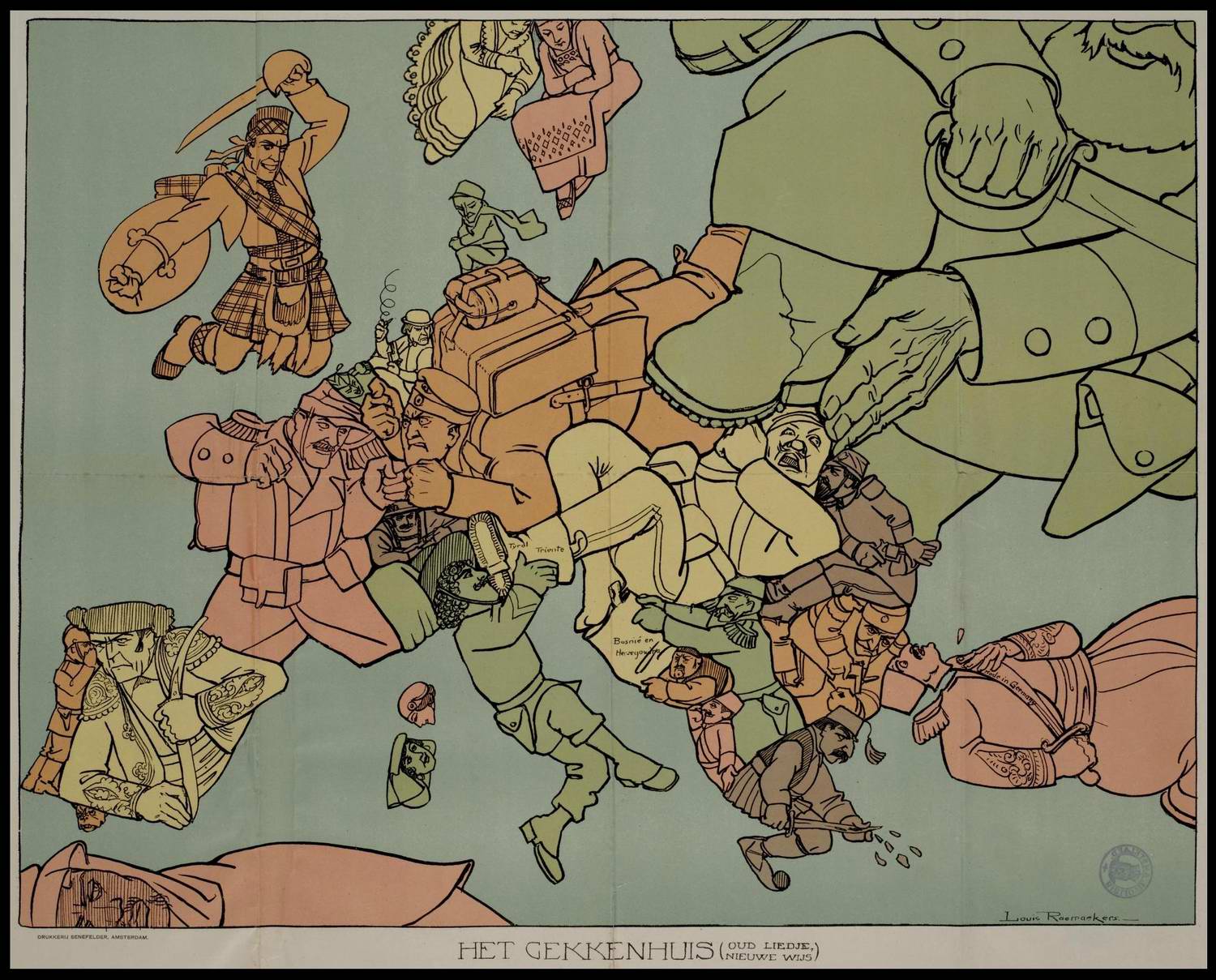
(Image of a Dutch map from 1915. More propaganda maps here: “They were obtained from the University of Amsterdam website where you can zoom in to high magnification. [via Briefe an Konrad]”.)
