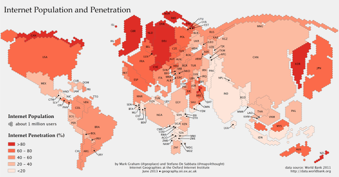
Rebecca J. Rosen passes along the above map, which resizes countries to reflect their online populations:
The map, created as part of the Information Geographies project at the Oxford Internet Institute, has two layers of information: the absolute size of the online population by country (rendered in geographical space) and the percent of the overall population that represents (rendered by color). Thus, Canada, with a relatively small number of people takes up little space, but is colored dark red, because more than 80 percent of people are online. China, by contrast, is huge, with more than half a billion people online, but relatively lightly shaded, since more than half the population is not online. Lightly colored countries that have large populations, such as China, India, and Indonesia, are where the Internet will grow the most in the years ahead. (The data come from the World Bank’s 2011 report, which defines Internet users as “people with access to the worldwide network.”)
