Barro breaks down Obamacare enrollments by state:
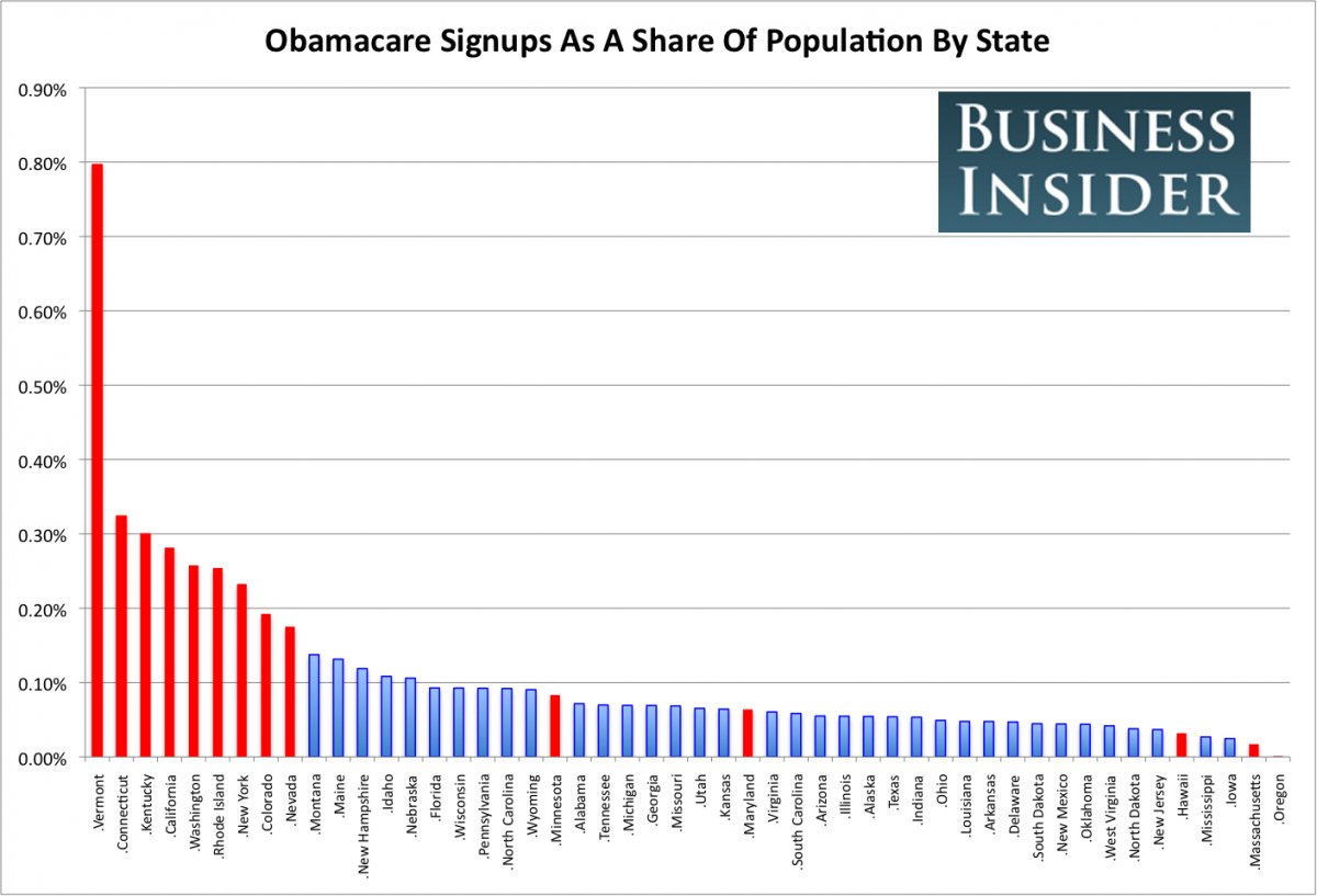
The first thing that jumps out is that the nine states with the highest enrollment by share of population all run their own exchanges — which, in general, have been working much better than Healthcare.gov, the federally-run exchange. The 14 states running their own exchanges are indicated in red on the graph.
Vermont has, by far, the highest rate of sign ups as a share of its population: 0.8%. It’s followed by Connecticut, Kentucky and California. Because of its large population, California accounts for about 30% of total Obamacare sign-ups, at 107,087. New York, another state running its own exchange, has provided more than 45,000 enrollments.
Nationally, only 0.12% of Americans signed up for private health insurance made available by the Affordable Care Act between Oct. 1 and Nov. 30; that figure must rise to 2.2% for the Obama Administration to reach its goal of 7 million sign-ups by March 31.
TPM has an interactive graphic comparing enrollments:
[T]here is wide disparity across states — and a lot of that can be traced to HealthCare.gov’s problems. California (107,087) has enrolled almost as many people in private coverage as the 36 states served by the federal site combined. Kentucky (13,145), which built its own site, has enrolled almost as many people as Texas (14,038), which relied on the feds.
