Dan Selcke introduces a new graphing tool:
Arguing the merits and demerits of a favorite TV show is an exercise plagued with uncertainty. What some viewers see as a well-developed, three-dimensional character, others may see as a grating waste of space, and one person’s daring plot twist is another person’s nonsensical cop-out.
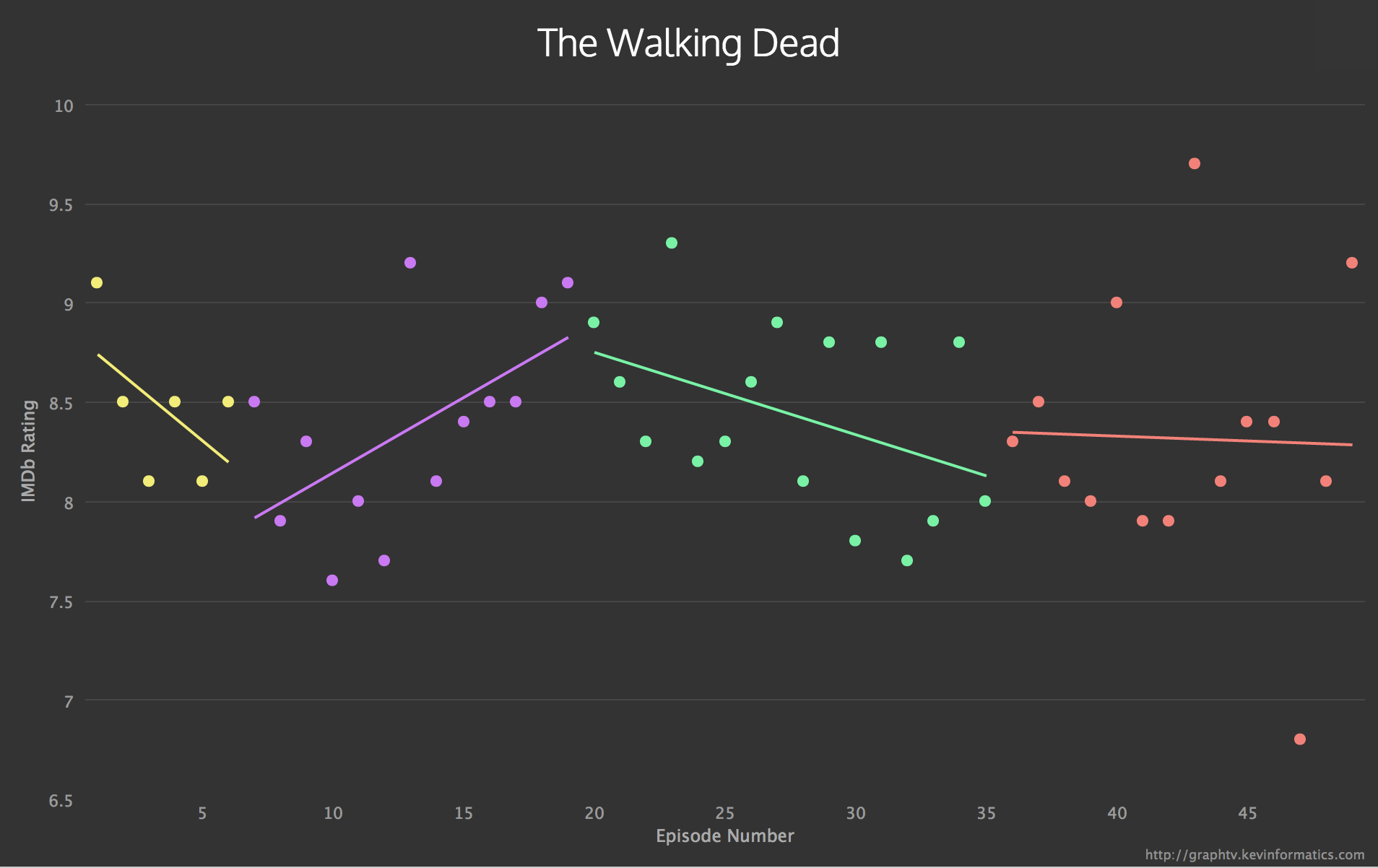
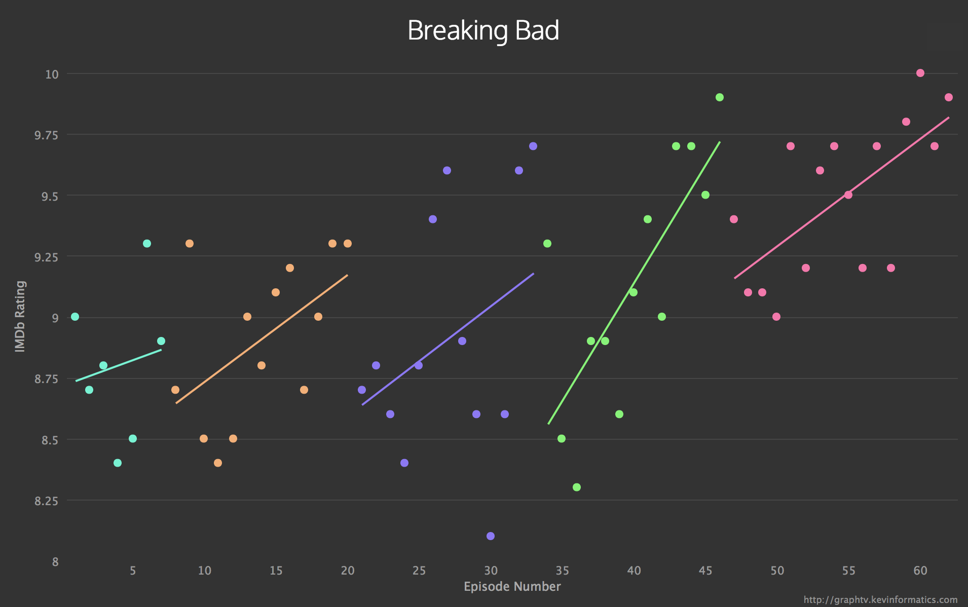
With Graph TV, this is no longer a problem. The website, created by software engineer Kevin Wu, looks up the IMDB user ratings for every episode of a given TV show and turns them into points on simple graphs that show the ebb and flow of public opinion over the course of a series. Each season of the show is coded with a different color, so users can see, for example, which seasons of Dexter received more praise as they went on and which ones tumbled down the Y-axis faster than an Olympic bobsled team with nothing left to lose.
The Walking Dead‘s inconsistency is charted below: