Chart Of The Day II

Black Males College

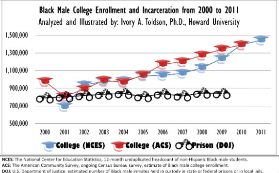
Ivory Toldson discovers that, contrary to popular belief, there are far more black males in college than prison. He thinks the myth has perverse effects:

Consider this: If all 1,127,170 black males who were enrolled in undergraduate programs in 2010 eventually graduated, the total number of black males with college degrees would increase by 71 percent, nearly achieving parity with white males. However, we will not sufficiently support black male college students — nor college-bound students — if we simply keep perpetuating the myth that juxtaposes their needs with those of black males in the criminal-justice system.

(Hat tip: Bouie)

Chart Of The Day

debt knowledge

Michael Tesler finds “that public perceptions of the debt’s importance are fundamentally linked to which party is making it an issue”:

Back in December 2007, politically attentive Democrats were 20 percentage points more likely than politically attentive Republicans to say that the federal budget deficit was at least a very important issue. Four years later, though, the most politically attentive Republicans were now a whopping 60 points more likely than their Democratic counterparts to say the deficit is very important.

Yglesias adds:

[I]t’s crucial to understand that the flip-flopping happens with the best-informed people not the worst-informed people. If you’re well-informed you gain a lot of information about “your side’s argument” on the issues of the day and map your opinions to the shifting political currents.

Update from a reader:

I’m sure lots of people are emailing you about this today, but I figured I’d jump in anyway. We were in a very different place in the economic cycle in 2007 and 2011. Basic Keynesianism tells us that deficits are problematic when the economy is at full output but necessary during demand-driven recessions. It’s certainly true that Democrats are more likely to be Keynesians than Republicans, but that doesn’t make the change of opinion flip-flopping. It makes it an informed application of a consistent theory in changing circumstances. Yglesias got serious flack in his comments section for the post you quoted from, for this very reason.

Chart Of The Day

policy mood

John Cluverius describes the Policy Mood (seen above), which “is calculated by aggregating hundreds of survey questions” and “captures shifts in the the popularity of increased government action over time”:

One of the key aspects of policy mood is that tends to react against prevailing government policies. Christopher Wlezien described this response as a “thermostat”: after the government does more and spends more, policy mood becomes less liberal; after the government does less and spends less, it becomes more liberal.  This effect has been discussed in greater detail previously on this blog and others. In particular, the public’s policy mood responds to changes in party control of the White House.  The public becomes more liberal during the administration of Republican presidents, and more conservative under the administration of Democratic presidents.

Chart Of The Day

popelanguagechart

The Economist uses the Pope’s “linguistically notable” abdication – it was announced in Latin – to break down the languages used by Roman Catholics around the world:

What’s more interesting is the choice of languages the Holy See offered official translations for: French, English, German, Italian, Polish, Portuguese and Spanish. Much of the Catholic Church’s recent growth has been in Latin America and Africa. The use of Portuguese, Spanish, and English makes sense for outreach in the Americas. French might be useful for western and central Africa’s elites, but many people in officially Francophone countries don’t speak French. Missing from this list is Arabic, which the Pope tweets in. The Pope’s biweekly catechesis is provided in Arabic, but the weekly “Words of the Holy Father” typically omit the language. Translations in Croatian, spoken by 3.9m Catholics, are sometimes also available. According to our numbers, the Pope’s nine languages on Twitter represent 900m Catholics. Croatian is the only language not on Twitter while regularly available on the Vatican’s website.

Chart Of The Day

Sigh Cough

John Gruber noticed an asterisk-framed interjection (*cough*) in the New York Times and wondered about its roots:

Using asterisks this way strikes me as an Internet-ism. I would think those coughs should be italicized; using bounding asterisks is a substitute in plain text contexts, something we collectively started doing in email, newsgroups, web comments and forums, Twitter, and various other input fields where computer software doesn’t allow proper italics (or bold, or any other formatting).

With the help of Twitter, Gruber concludes *sigh* probably started in the 1960s thanks to the comic strip “Peanuts” and Charlie Brown’s constant invocation. Ben Zimmer traces longer usages (*hangs upside down like a bat*) to games like D&D:

As one “Role Play Manual of Style” explains, “Actions are enclosed in asterisks and written in third person perspective.” But this type of asterisking has thoroughly infected Usenet posts, blog comments, tweets, and anywhere else online that people feel the need to describe real-world actions in a virtual space.

Chart Of The Day II

A WaPo poll tested the popularity of various policies when Obama’s name is and isn’t attached to them. The results:

Obama_Poll

Waldman’s reaction:

[H]ow should Obama interpret this information? The answer is that there isn’t much he can do about it. The Postarticle suggests, tongue in [cheek] I’m assuming, that he shouldn’t mention that he supports a path to citizenship in his State of the Union address. But it isn’t like we’re going to have a big debate about immigration reform in which the President is able to keep his position a secret. That’s the thing about being in charge—for better or worse, voters are going to know where you stand, and the more attention an issue gets—in other words, the closer it gets to being resolved with new legislation—the more that’s true.

Chart Of The Day

Nathan Yau admires a chart on US gun violence:

Information visualization firm Periscopic just published a thoughtful interactive piece on gun murders in the United States, in 2010. It starts with the individuals: when they were killed, coupled with the years they potentially lost. Each arc represents a person, with lived years in orange and the difference in potential years in white.

Chart Of The Day

A new ABC poll takes the public’s temperature on immigration:

Immigration_Popularity

Drum analyzes:

[A] good rule of thumb is that on any contentious issue, you’d better start with at least 60 percent support. Two-thirds is even better. Because once the attack ads start running and the radio bloviators start bloviating, those numbers are going to slide downward. If “path to citizenship” is only polling at 55 percent before this stuff starts, it’s not likely to stay in majority territory for very long.

Chart Of The Day

Fallback_Positions

Lisa Wade parses the above chart for insight into gender roles at home:

Here’s some great news.  The vast majority of young people – about 80% of women and 70% of men across all races, classes, and family backgrounds — desire an egalitarian marriage in which both partners share breadwinning, housekeeping, and child rearing.  The data come from Kathleen Gerson‘s fabulous 2010 book, The Unfinished Revolution.

But:

Gerson asked her respondents what type of family they would like if, for whatever reason, they couldn’t sustain an equal partnership.  She discovered that, while men’s and women’s ideals are very similar, their fallback positions deviate dramatically.

Chart Of The Day

6a00d83451c45669e2017c367d01d4970b-550wi

The Economist surveys plastic surgery around the globe:

Non-invasive treatments to plump out wrinkles, smooth lines and remove hair account for more than half of all procedures: over 3m of these are for botox alone. America is home to more cosmetic enhancement than anywhere else, but accounting for population reveals a different story. On that measure, more primping and preening goes on in South Korea, Greece and Italy, as the chart below shows. The most popular invasive (ie, surgical) operation is fat removal, or lipoplasty, reflecting a growing problem for a fattening world. Breast augmentation, the second biggest surgical procedure, is most commonly performed in America and Brazil. Buttock implants are also a Brazilian specialty, as is vaginal rejuvenation.