Chart Of The Day

29edsal-chart-articleLarge

If you don’t follow Tom Edsall’s columns in the NYT, you’re missing some of the best deep-dive policy pieces on the web. When Ezra Klein speaks of integrating context into news, it sounds a little luftmenschy in the abstract. But Edsall does it all the time in a simple column. His latest is a must-read on a new, and potentially debate-changing book on the accelerating rise of inequality around the world. The book is Thomas Piketty’s Capital in the Twenty-First Century, due out in the US this March, but already a sensation in France. Piketty talks about his book here.

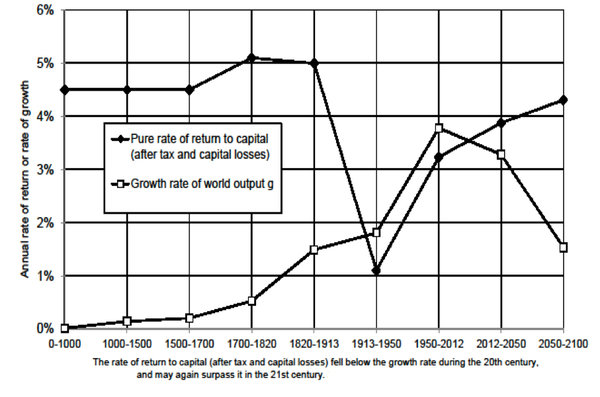
What Piketty is proposing is that the twentieth century was an anomaly in the history of global capitalism:

The six decades between 1914 and 1973 stand out from the past and future, according to Piketty, because the rate of economic growth exceeded the after-tax rate of return on capital. Since then, the rate of growth of the economy has declined, while the return on capital is rising to its pre-World War I levels.

“If the rate of return on capital remains permanently above the rate of growth of the economy – this is Piketty’s key inequality relationship,” Milanovic writes in his review, it “generates a changing functional distribution of income in favor of capital and, if capital incomes are more concentrated than incomes from labor (a rather uncontroversial fact), personal income distribution will also get more unequal — which indeed is what we have witnessed in the past 30 years.”

Edsall provides a variety of expert judgments on the book. I have a profound proclivity for exciting ideas that suggest we’re all doomed – so take my interest with a pinch of salt. But the book powerfully suggests a rather determinist view that capitalism constantly sows the seeds of its own destruction, by gradually and inexorably increasing social and economic inequality in such a way as to undermine the legitimacy of democratic politics that undergirds its existence. Let’s just say that Tom Perkins and Paul Ryan – as well as unreconstructed liberals who think government can truly defeat accelerating inequality – should read it.

Chart Of The Day

oustide_spending

Drum looks at what Citizens United has unleashed:

The chart [above], based on data from Open Secrets, shows spending on midterm elections through January 21 in order to get a clean comparison of 2014 with previous election years.

Up through 2006, outside spending at this point in the election cycle had been flat for years at a very low level. In 2010, we were on an upward trajectory even before the Citizens United decision was handed down. And 2014? With Citizens United now in full operation, the sluice gates have opened wide. Outside spending is 25 times higher than it was at this point in 2006. Welcome to the future of American elections.

Meanwhile, Seth Masket studies publicly financed campaigns. One drawback to them:

Miller and I, along with Andrew Hall, have found some preliminary evidence that public financing contributes to partisan polarization. The method by which this occurs is not completely clear, but it appears that when we open up elections to a wider range of candidates, the candidates who take advantage of this tend to be more ideologically extreme than those who rise up through traditional financing schemes. Party donors don’t get to filter out candidates the way they normally do. My guess is that this outcome is not what most backers of public financing initially hoped for.

Chart Of The Day

Marijuana Enforcement

Marijuana enforcement is getting more lax:

The chart [above] presents 2007-2012 FBI Uniform Crime Reports data on marijuana possession arrests and National Survey on Drug Use and Health data on aggregate days of American marijuana use … To put the two lines on the same scale, aggregate days of marijuana use are reported in 10,000s. The most striking feature of the data are that the two lines are going in opposite directions. The net result is a 42% decline in marijuana possession enforcement intensity (i.e., the number of arrests per day of marijuana use).

Chart Of The Day

The rankings of the top 20 metro areas in the US over the past 200 years (click to enlarge):

Top Metro 2010

Cillizza comments:

Starting in the early 19th century, New York City has been number one and never given up that pole position. (It’s the Kentucky hoops recruiting class of big city populations.) Philadelphia, too, has been relatively consistent population-wise over the centuries — starting at number one in 1790 and standing at number five in 2010. Los Angeles, which only entered the top 20 metros in 1910, is now the second largest. Chicago — President Obama’s hometown — has risen from the mid-teens in late 1800s all the way to number three in 2010. …

Even more intriguing are the metros that have tumbled significantly over the decades.

Follow Detroit’s rise and fall and you follow the rise and fall of the manufacturing industry in America. The Motor City broke into the top 20 in 1840 and within 100 years was one of the five largest metro areas in the country. The last three decades have seen a population free fall in Detroit, however, all the way to the number 12 in 2010. St. Louis is now barely on the list after peaking at the fourth most populous metro area in the late 1800s. Baltimore has fallen from top five to barely top twenty.

He also looks at how current trends could change the electoral map:

In short, the demographic changes that began in the 1980s — population losses in the Northeast and Midwest, population gains in the South, Southwest and Plains — will only accelerate over the next few decades. … Republicans are right then to note that the states that will grow population-wise over the next five decades are in places where they have traditionally done well at the presidential level. But, the areas of growth within those states tend to be in places and groups where Republicans have struggled in recent elections. And, even if the 2060 map were in place in 2012, Romney still loses the election by a wide margin.

Chart Of The Day

Climate Pie Chart

James Powell updates his chart on global warming research:

I have brought my previous study (see here and here) up-to-date by reviewing peer-reviewed articles in scientific journals over the period from Nov. 12, 2012 through December 31, 2013. I found 2,258 articles, written by a total of 9,136 authors. (Download the chart above here.) Only one article, by a single author in the Herald of the Russian Academy of Sciences, rejected man-made global warming. I discuss that article here.

Holly Richmond passed along the chart:

[I]f a year-long sample isn’t good enough for you, Powell previously examined 21 years of peer-reviewed literature and found that only 24 out of 13,950 articles — or two-tenths of a percent — came out and rejected human-caused climate change.

The fact that one major political party in the US rejects outright this massive preponderance of scientific research is now so familiar to us that we forget just how obscene it is. It is not a position or an argument. It is a transparent lie in defense of short-term material interest against the long-term interests of everyone. There can and should be plenty of debate about what to do about human-caused climate change; but there should simply be no serious debate about its causes. It’s impossible to take the GOP seriously until they recant their knownothingness on this subject. At this point, it is simply an affront to reason.

Chart Of The Day

obamacare-boredom-cropped

Kliff finds evidence of Obamacare boredom:

Those who have watched other insurance expansions come and go offer two theories. One is that the coverage people signed up for is, by and large, working. And it’s a whole lot less exciting to write about things that work as they’re supposed to than things going haywire, as was the case with HealthCare.gov’s initial rollout. This is the more optimistic theory of Obamacare boredom: The law is working, thus leaving us reporters with few screw-ups to write about. … Another possibility is that the problems just haven’t cropped up quite yet.

Chart Of The Day

Prison admissions

Prison admissions are down:

When President Obama was elected, the rate of prison admission was just 3% below its 2006 level, which was very probably the highest it has ever been in U.S. history. But by the end of Obama’s first term, it had dropped to a level not seen since President Clinton’s first year in office.

Alex Tabarrok adds:

Drug-related imprisonments are especially down. In 1991, for example, 23% of the prisoner’s sentenced for more than one year were sentenced for drug related reasons (including 8.2% for drug possession). In 2011 only 16.6% of imprisonments for more than one year were for drug-related reasons (including 4.1% for drug possession.) This trend is likely to continue with further drug legalization.

Drum, no surpriseconnects the number to lead abatement:

Incarceration rates are way down for men in their teens and 20s, who grew up in the relatively lead-free post-1990 environment. But for older men, who grew up before then, incarceration rates are actually up. Lead did its work on them long ago.


Chart Of The Day

Convention Against Torture

Eric Posner, writing at his new blogpresents a depressing graph on the effects of the Convention Against Torture:

The line shows the average torture score for countries during the five years leading up to ratification and the five years following ratification (where 0 refers to frequent torture and 2 refers to no torture). If the average country had reduced torture during this period, then the line would have sloped up.

But in this period, America became a torture camp on a hill, just as the Founders dreamed it would be.

Chart Of The Day

The percent of federal and private sector workers who are satisfied with their jobs:

Government Employees

Among the reasons federal employees increasingly dislike their work:

In particular, government employees hate their bosses. On average, people reported a 51.8 percent satisfaction level with their senior leaders, and this agency-by-agency breakdown indicates that there’s some pretty harsh boss-hate in certain government offices (my heart goes out to you, Financial Crimes Enforcement Network leaders: a 22.5 percent approval rating has got to hurt).

Orszag worries about this finding:

One reason federal workers are frustrated with their senior leadership is that the government isn’t doing much of substance. People are attracted to public service in no small part because they believe government can be a force for good; when the government does little, that belief is harder to sustain. Similarly, political polarization and a general decline in public expectations for government make it harder to attract talented people to lead the bureaucracy.

Chart Of The Day

obamacare-sign-ups

Barro breaks down Obamacare enrollments by state:

The first thing that jumps out is that the nine states with the highest enrollment by share of population all run their own exchanges — which, in general, have been working much better than Healthcare.gov, the federally-run exchange. The 14 states running their own exchanges are indicated in red on the graph.

Vermont has, by far, the highest rate of sign ups as a share of its population: 0.8%. It’s followed by Connecticut, Kentucky and California. Because of its large population, California accounts for about 30% of total Obamacare sign-ups, at 107,087. New York, another state running its own exchange, has provided more than 45,000 enrollments.

Nationally, only 0.12% of Americans signed up for private health insurance made available by the Affordable Care Act between Oct. 1 and Nov. 30; that figure must rise to 2.2% for the Obama Administration to reach its goal of 7 million sign-ups by March 31.

TPM has an interactive graphic comparing enrollments:

[T]here is wide disparity across states — and a lot of that can be traced to HealthCare.gov’s problems. California (107,087) has enrolled almost as many people in private coverage as the 36 states served by the federal site combined. Kentucky (13,145), which built its own site, has enrolled almost as many people as Texas (14,038), which relied on the feds.