Map Of The Day

Press Freedom

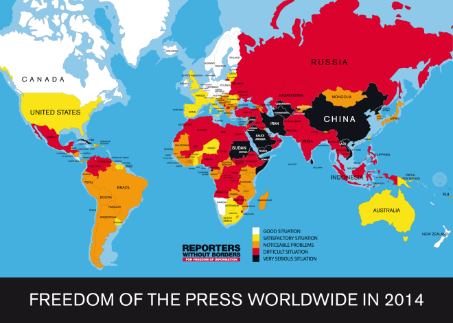
Last week, Reporters Without Borders released its annual report on global press freedom. Chris Kirk unpacks the findings:

The map, based on Reporters Without Borders’ press freedom rankings for 180 countries, shows home of the current Winter Olympics Russia in bright red, indicating a “difficult situation” for journalists and bloggers there. Russia, ranked 148th, shuts down seditious websites, bans so-called homosexual propaganda, prohibits religiously offensive expression, and heavily controls national TV stations, Russians’ main source of news.

The U.S. shows a “satisfactory situation,” but it has dropped 14 ranks since last year’s report and now sits at the 46th spot.

Eric Levenson explains the drop:

The rankings report blame the U.S.’s drop on its wide-ranging crackdown on whistleblowers, particularly Edward Snowden, Chelsea Manning (who got a 35-year sentence for leaking documents), and the attempted 105-year sentence for Barrett Brown. To the American government, “The whistleblower is the enemy,” the report writes. Similarly, the subpoena of Associated Press phone records contributed to that drastic drop.

Friedersdorf’s response to the report:

Countries that scored better include Romania,  South Africa, Ghana, Cyprus, and Botswana. And 40 others. Put simply, it’s an embarrassing result for the country that conceived the First Amendment almost 240 years ago. These rankings are always a bit arbitrary, but we’re not anywhere close to the top tier these days. Why?

Map Of The Day

London

Nathan Yau pulled data from a running app to map common routes:

If there’s one quick (and expected) takeaway, it’s that people like to run by the water and in parks, probably to get away from cars and the scenery. In the smaller inland cities, there seem to be a few high-traffic roads with less running elsewhere.

The map for London is above. Other major cities here.

Map Of The Day

Healthcare Senate

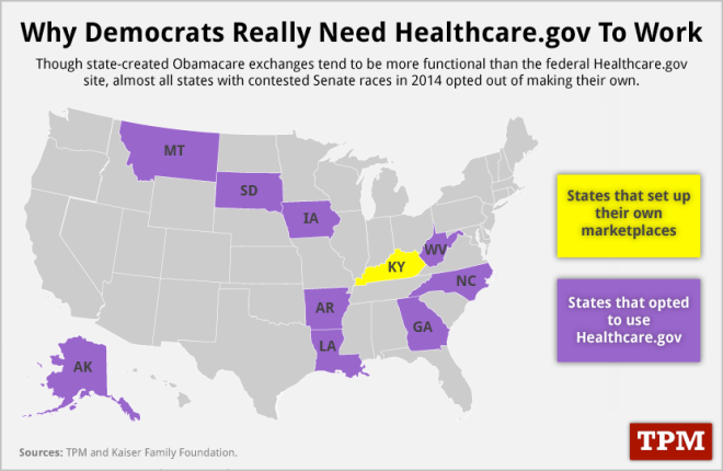
The performance of Healthcare.gov could have a major impact on the Senate races:

Of the top ten most contested seats in 2014, nine of them are in states where people must sign up for Obamacare through Healthcare.gov thanks to those states’ refusal to open up their own state healthcare marketplace. That means that voters in those states will be forced to use Healthcare.gov to sign up for health insurance, making it all the more important that the website is functioning in time for upcoming signup deadlines.

Alex Roarty looks at red-state polling on Obamacare:

An imposing plurality of adults in states that backed Mitt Romney last year say they are more likely to oppose than support a lawmaker who backs the health care law, according to an ABC News/Washington Post survey. Forty-six percent of red-state citizens said they’d be less inclined to support the candidate; only 15 percent said they’d be more inclined.

Overall, the law’s unpopularity has dipped far lower since its disastrous rollout, with disapproval of the Affordable Care Act among all adults spiking considerably since last month.

Those numbers draw a bull’s-eye on the back of the four red-state Democratic incumbents who voted for the health care reform in 2010 and are up for reelection in 2014: Mary Landrieu in Louisiana, Mark Begich in Alaska, Mark Pryor in Arkansas, and Kay Hagan in North Carolina.

Sean Sullivan also analyzes the latest numbers:

In addition to using the law to go after Democrats, there’s another reason that Republicans are expected to harden their criticism of Obamacare: GOP primaries, where there will be little appetite for anything less than robust opposition to Obamacare.

Seventy-one percent of Republican voters say they are more likely to oppose a candidate if that candidate supports the law, the highest level in Post-ABC polls. Intensity runs high for GOP voters, with 56 percent who would be much more likely to oppose the candidate. Just 8 percent of Republican voters say they would be more likely to support a candidate if that candidate supports the law.

Map Of The Day

Twitter users dropping the F-bomb in real time:

Screen Shot 2013-11-12 at 11.46.54 AM

John Metcalfe elaborates:

What ties together a Bostonian upset over being ignored, a woman in Dallas angry about her empty refrigerator, and a resident of Portland, Oregon, who’s still steaming over the wars of George W. Bush? It’s their potty-mouths: Last night, each of these people blasted their Twitter followers with the word “fuck,” or one of its variants like WTF or OMFG. Each of these guys are included in this gloriously profane “FBomb Map,” which displays real-time instances of Twitter cursing as mushroom clouds popping up all over the world.

Map Of The Day

dish_electoralmap1880

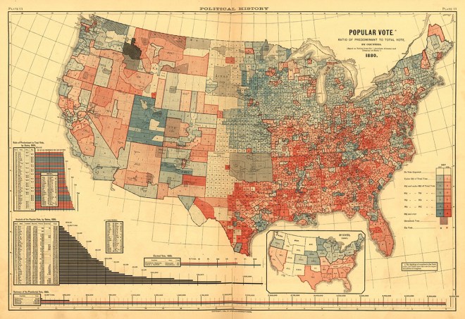
Historian Susan Schulten found this map of the 1880 election while leafing through the 1883 Statistical Atlas of the United States:

“That era was basically the last time the parties were as strong as they are now,” says Seth Masket, a political scientist at the University of Denver and colleague of Schulten’s. “We’re not talking about slavery or the aftermath of the Civil War,” he says, but “we are talking about fundamental ideological differences about what this country stands for.”

This was the era when a “solid South” emerged, although back then the parties were flipped, and white Southerners flocked to the then more conservative Democratic Party (in red on the map). The 1880 election, between Republican James Garfield and Democrat former Civil War general Winfield Scott Hancock, was remarkably close–with Garfield eking out the popular vote by the smallest of margins (48.3% vs. 48.2%). The biggest issue of the day was a debate over the tariff, which Republicans backed. More importantly, the election was viewed as a referendum on the painful process of Reconstruction.

Schulten points out why the map is remarkable. Not only did it break down results by county, which would have been cumbersome data to collect at the time, but it also shaded each county by the margin of victory–a mapping technique that imparted extra information and had not been used before. It helps us understand where the “swing” states of the Gilded Age were (Pennsylvania, Virginia), and assists observers in understanding why eastern Tennessee went “blue” (this region was loyal to the Union in the Civil War).

Map Of The Day

Internet Population

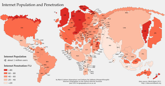
Rebecca J. Rosen passes along the above map, which resizes countries to reflect their online populations:

The map, created as part of the Information Geographies project at the Oxford Internet Institute, has two layers of information: the absolute size of the online population by country (rendered in geographical space) and the percent of the overall population that represents (rendered by color). Thus, Canada, with a relatively small number of people takes up little space, but is colored dark red, because more than 80 percent of people are online. China, by contrast, is huge, with more than half a billion people online, but relatively lightly shaded, since more than half the population is not online. Lightly colored countries that have large populations, such as China, India, and Indonesia, are where the Internet will grow the most in the years ahead. (The data come from the World Bank’s 2011 report, which defines Internet users as “people with access to the worldwide network.”)

Map Of The Day

discoveries6

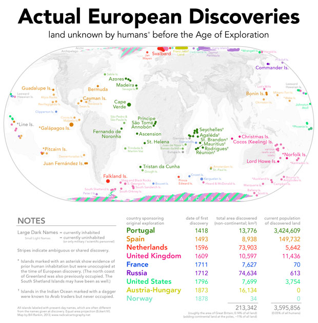
Historian Bill Rankin captions:

Every Columbus Day, we’re reminded of the difference between discovery and “discovery” – and rightly so. But let’s not sell Europe short; after all, European explorers found plenty of diminutive islands that no human had ever seen before, along with extravagant amounts of ice and snow. Just the islands alone add up to more than 0.14% of the world’s total land area, and today they’re home to more people than live in all of Connecticut!

All sarcasm aside, it’s worth remembering that almost everywhere Europeans went, they were met by existing inhabitants. Even in the vast Pacific and the barren Arctic, only a few isolated coasts were truly terra nullius. (Indeed, this map particularly underscores the maritime expertise of Pacific Islanders. Unlike the islands of the Atlantic and Indian Oceans, nearly all of the Pacific was settled by the 14th century.)

(Hat tip: Benjy Hansen-Bundy)

Map Of The Day

This embed is invalid


The interactive map shows the various rates of traffic deaths around the world:

The map is part of “Roads Kill,” a series of reported pieces on global traffic safety. Editor Tom Hundley notes that traffic fatalities around the world have reached 1.24 million per year and could triple by 2030. In the developing world, road accidents will soon overtake HIV/AIDS, malaria, and tuberculosis to become the fifth leading cause of death. A number of countries are profiled individually as part of the project, including Egypt, where journalist Lauren Bohn writes that yearly traffic fatalities are roughly equal to the number who died in 2011 uprising and cost the country more than $1 billion per year.

Map Of The Day

Map

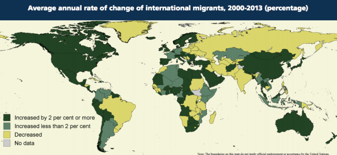
Robert Tenorio responds to new data (pdf) on the world’s 232 million migrants:

Do most migrants go from poor countries to rich countries?

No. This may be one of the biggest surprises from the UN data. The number of people living in developing countries who were also born in a developing country is about the same as the number of people from developing countries who now live in developed ones. This so-called “South-South” migration partly reflects new economic opportunities in developing countries and stagnating growth in the rich world, but that’s not the whole picture. Many migrants simply find it easier to move to developing countries. This may be because of more relaxed immigration laws, family and social networks that facilitate the move, or ordinary geographic proximity. Another large contributor to South-South movement is conflict, as over 2 million Syrian refugees in Iraq, Lebanon, Jordan, and Turkey have recently made clear.

The US remains the world’s top migration destination in absolute terms, with 45 million residents born abroad. But its rate of growth, 2.1 percent annually over the past three years,  falls far behind that of South Africa (6.7 percent), Thailand (8.3 percent), or Ecuador (9.7 percent).