Map Of The Day

by Chas Danner

Kyle Vanhemert passes along a remarkably detailed look at America’s racial makeup. Here’s the Eastern US:

dustin-cable-race-map-key

Vanhemert explains what makes this map so special:

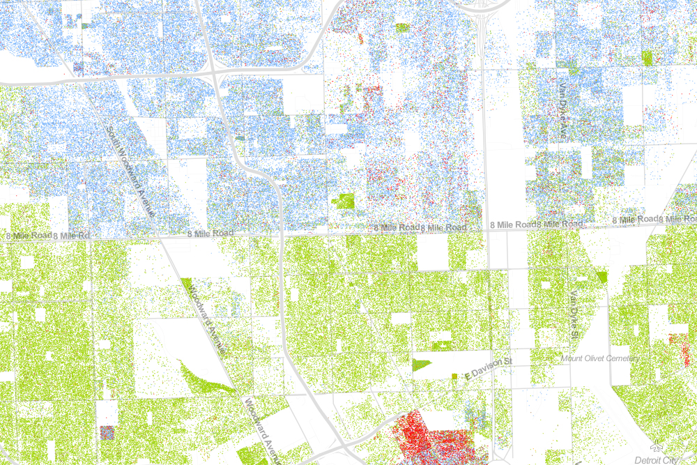
The map, created by Dustin Cable at University of Virginia’s Weldon Cooper Center for Public Service, is stunningly comprehensive. Drawing on data from the 2010 U.S. Census, it shows one dot per person, color-coded by race. That’s 308,745,538 dots in all–around 7 GB of visual data. It isn’t the first map to show the country’s ethnic distribution, nor is it the first to show every single citizen, but it is the first to do both, making it the most comprehensive map of race in America ever created.

White people are shown with blue dots; African-Americans with green; Asians with red; and Latinos with orange, with all other race categories from the Census represented by brown. Since the dots are smaller than pixels at most zoom levels, Cable assigned shades of color based on the multiple dots therein. From a distance, for example, certain neighborhoods will look purple, but zooming-in reveals a finer-grained breakdown of red and blue–or, really, black and white.

This is Detroit:

detroitlabel

Explore the full interactive map here. Recent Dish discussion of the South, race, and social mobility is here.

Map Of The Day

Odra Noel’s “Map of Health,” on display at the Royal Society’s Summer Science Exhibition in London, illustrates the diseased tissues that most affect each part of the world:

dish_tissue_map

Robert Gonzalez calls the piece “a weirdly beautiful combination of epidemiology and microscopy”:

North America, plagued by its obesity epidemic, is depicted as adipose tissue (fat). Central and South America are represented with pulmonary tissue, reflecting the lethal impact of smoking and respiratory illness in the region. Europe and Russia, their aging populations more susceptible to neurodegenerative diseases, are depicted with brain tissue; East Asia and the Pacific are represented with pancreatic tissue, which is affected keenly by diabetes. Much of the Middle East and central Asia, where cardiovascular diseases are on the rise, are painted with microscopic representations of heart muscle. Africa, where transmittable infections like malaria and HIV pose enormous challenges to public health, is depicted with blood cells. All data was taken from statistics gathered by the World Health Organization.

More here.

Map Of The Day

dish_usmapbrands

Kevin Hartnett highlights it:

At a glance it’s just eye candy: Steve Lovelace of Dallas has created a map of the United States, where each state is filled with the logo of a corporation that originated there. Gillette for Massachusetts, Anheuser-Busch for Missouri, Apple for California, L.L. Bean for Maine. On his website Lovelace acknowledges that his choices are subjective, based on his judgment about which well-known corporations best represent the states they originated in, rather than objective criteria like choosing state’s biggest employer or most valuable company. Some of his choices were a given (Starbucks for [Washington], General Motors for Michigan), others were inspired (Pillsbury for Minnesota, Garmin for Kansas), while a few have a whiff of irony about them (Saks for Alabama, for instance).

Lovelace lists the featured companies by state here. It’s not as great as this video though.

Map Of The Day

Gay Tolerance

Pew asked (pdf) citizens of 39 countries, “Should society accept homosexuality?” Max Fisher mapped the results:

It’s not even close. While there’s wide variation in places like Latin America and Europe, Africa is almost uniformly anti-gay. Nigeria is the only surveyed country where just one percent say society should accept homosexuality; 98 percent said society shouldn’t. Results are under 10 percent for almost the entire continent, including sub-Saharan Africa and North Africa, which has closer cultural ties to the Middle East. The important exception is South Africa, famous for its gay rights movement, where a still-low 32 percent answered “yes.”

Muslim-majority countries tended to reject homosexuality, with results under 10 percent for Islamic societies from Africa to Southeast Asia to the Middle East. The only exception is Lebanon, although the country is only about two-thirds Muslim. Only 2 percent of Pakistanis and Tunisians – who are generally considered cosmopolitan by Mideast standards – said society should accept gays.

To be clear, though, some Christian-majority countries also overwhelmingly say that society shouldn’t accept homosexuality: Ghana and Uganda, both in sub-Saharan Africa.

Map Of The Day

soviet visitors

From the annals of paranoia – during the Cold War, large parts of the US was off limits to Soviets:

If you were one of select few private Soviet citizens granted permission to visit the United States in 1955, you could take in a Cubs game or ski Jackson Hole, but if you wanted to sample Memphis barbecue or check out the factories in Youngstown, Ohio, you’d be out of luck. That’s because a National Security Council directive had, on Jan. 3, 1955, allowed some “Soviet citizens in possession of valid Soviet passports” into the country, while extending controls previously placed on visiting Soviet diplomats and official representatives to apply to their travel.

This map shows where Soviet citizens, who were required to have a detailed itinerary approved before obtaining a visa, could and could not go during their time in the United States. Most ports, coastlines, and weapons facilities were off-limits, as were industrial centers and several cities in the Jim Crow South.

A Hate Map Of The US

dish_hate1

Researchers at Floating Sheep analyzed more than 150,000 geotagged tweets that included a homophobic, racist, or ableist slur and mapped the data:

Perhaps the most interesting concentration comes for references to ‘wetback’, a slur meant to degrade Latino immigrants to the US by tying them to ‘illegal’ immigration. Ultimately, this term is used most in different areas of Texas, showing the state’s centrality to debates about immigration in the US. But the areas with significant concentrations aren’t necessarily that close to the border, and neither do other border states who feature prominently in debates about immigration contain significant concentrations.

… Ultimately, some of the slurs included in our analysis might not have particularly revealing spatial distributions. But, unfortunately, they show the significant persistence of hatred in the United States and the ways that the open platforms of social media have been adopted and appropriated to allow for these ideas to be propagated.

Brian Anderson adds:

How can we be sure “positive” uses of an otherwise hateful slur (e.g., “dykes on bikes #SFPride”) weren’t inadvertently swept up in the Geography of Hate? Contextualiztion is crucial–is everything, really. Did Stephens’ team allow for it? They did. In fact, this is why they used humans (read: Humboldt State students), not machines, to analyze the entirety of the 150,000 offending tweets, all drawn from the University of Kentucky’s DOLLY project.

An interactive version of the map is here.

Map Of The Day

YouTube has released an interactive map showing the most popular videos throughout the country. At the moment, the top videos appear to be the Charles Ramsay interview and Alan Jackson’s rendition of “He Stopped Loving Her Today” in honor of George Jones’ (covered by the Dish here and here):

YouTube Map 20130507 A

When the metric is switched to just men, the video “Zachary Quinto vs. Leonard Nimoy: ‘The Challenge’” surges in popularity. Recently, when the metric was switched to just women, the 6th season trailer for True Blood swept the nation.

Map Of The Day

by Patrick Appel

Female Morality Rates

Bill Gardner flags an article [paywalled] that found “female mortality rates increased in 42.8% of counties (male mortality rates increased in only 3.4%).” The geographic breakdown of female mortality rates is mapped above:

This trend is amazing in a historical context. Overall US life expectancy had been increasing steadily over the decades. Before seeing data like these, I had the simple view that increasing life expectancy was part of a general increase in human well-being, powered by the steady growth in economic well-being. In fact, US GDP per capita increased from $24,400 in 1992 to $44,600 in 2006 (in current US $). This is a huge shot for the average American (although it was less for the median American). But a large subgroup of women was apparently left behind.

Map Of The Day

by Zoe Pollock

Mark Graham mapped “the percentage of local edits to [Wikipedia] articles about places” in order to measure “the percentage of edits about any country that come from people with strong associations to that country”:

Unsurprisingly, they show that in predominantly English-speaking countries most edits tend to be local. That is, we see that most Wikipedia articles (85%) about the US tend to be written from America, and most articles about the UK are likewise written from the UK (78%). The Philippines (68%) and India (65%) score well in this regard, likely because of role that English plays as an official language in both countries. But why then do we see relatively low numbers is other countries that also have English as an official language, such as Nigeria (16%) or Kenya (9%)?

His takeaway:

Some parts of the world are represented on one of the world’s most-used websites predominantly by local people, while others are almost exclusively created by foreigners, something to bear in mind next time you read a Wikipedia article.