Below are the finalists we’ve selected for the Chart Of The Year, please review them and then vote for your favorite at the bottom of the page.
James Powell updates his chart on global warming research:
I have brought my previous study (see here and here) up-to-date by reviewing peer-reviewed articles in scientific journals over the period from Nov. 12, 2012 through December 31, 2013. I found 2,258 articles, written by a total of 9,136 authors. (Download the chart above here.) Only one article, by a single author in the Herald of the Russian Academy of Sciences, rejected man-made global warming. I discuss that article here.
Holly Richmond passed along the chart:
[I]f a year-long sample isn’t good enough for you, Powell previously examined 21 years of peer-reviewed literature and found that only 24 out of 13,950 articles — or two-tenths of a percent — came out and rejected human-caused climate change.
The fact that one major political party in the US rejects outright this massive preponderance of scientific research is now so familiar to us that we forget just how obscene it is. It is not a position or an argument. It is a transparent lie in defense of short-term material interest against the long-term interests of everyone. There can and should be plenty of debate about what to do about human-caused climate change; but there should simply be no serious debate about its causes. It’s impossible to take the GOP seriously until they recant their knownothingness on this subject. At this point, it is simply an affront to reason.
Chris Kirk passes along an interactive graphic (screenshot above) that shows the prevalence and mortality rates for different types of cancer:
As the chart reflects, breast and prostate cancers are the most common, with 235,000 and 239,000 new cases last year respectively. Fortunately, they are relatively survivable cancers, though their mortality rates more than double by the 20-year mark. Pancreatic cancer is the most deadly, killing 96 percent of patients within five years. That’s partly because pancreatic cancer typically does not cause symptoms until it’s at a late stage of progression. For the same reason, liver cancer is the second-deadliest cancer, killing 93 percent of patients within five years.
The original graphic comes from David Taylor, who runs a data-visualization blog. Interactive version here.
3) Pizza Geometry:
Quoctrung Bui explains why you should always order the largest pizza:
The math of why bigger pizzas are such a good deal is simple: A pizza is a circle, and the area of a circle increases with the square of the radius. So, for example, a 16-inch pizza is actually four times as big as an 8-inch pizza. And when you look at thousands of pizza prices from around the U.S., you see that you almost always get a much, much better deal when you buy a bigger pizza.
Update from a reader:
As a real New Yorker, I feel it is important to share the information on the other reason to buy the largest pizza you can. In “real” pizza places (not chains), they pre-make the dough ahead of time and save it out into dough-balls. When you order your pizza, the pizza maker stretches the dough into the appropriate size for the pan, puts the sauce, cheese and toppings on, and shoves it in the oven. What he does not do, is say, “hmmm, they have ordered a medium pizza as opposed to the standard large pizza, let me take a portion of this dough off of my dough ball.” What you actually get is a pizza with a tougher, thicker, less-good crust because the dough is the right amount for the standard size pizza. And the standard sized pizza is a large.
On an unrelated note, I just renewed today. I upped my renewal from the standard rate ($19.99) to one dollar for every year I have been alive ($42). I think this will be my go-to going forward. I was going to just renew, but I found out yesterday I am getting a promotion, so my good fortune is your good fortune.
Damn, now I am hungry for pizza for lunch.
Matthew Klein’s interactive visualization on the ways we die is worth a few minutes of your time. One frame that sticks out:
5) Cursing Kids:
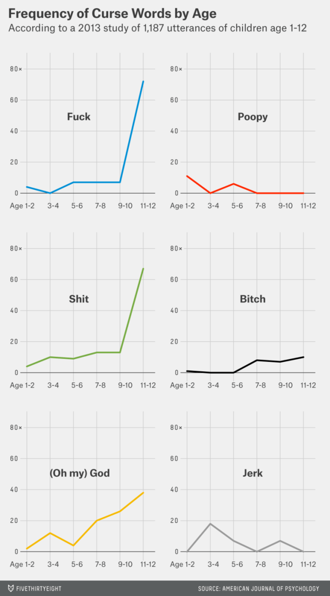
Mona Chalabi looks at childhood profanity:
A study published last year in the American Journal of Psychology collected “data about the emergence of adult like swearing in children.” … The study found that, overall, boys had a slightly larger repertoire of bad words than girls (95 compared to 80). But that repertoire varied by age. By age 3 or 4, girls were using 40 taboo words while boys were using 34; but among 7- and 8-year-olds, boys were using 45, and the number of bad words girls were using slipped down to 25.
Casselman debunks common misconceptions about the origins of America’s immigrants:
The immigration debate, now as then, focuses primarily on illegal immigration from Latin America. Yet most new immigrants aren’t Latinos. Most Latinos aren’t immigrants. And, based on the best available evidence, there are fewer undocumented immigrants in the U.S. today than there were in 2007. … The immigration debate gets one thing right: The foreign-born population is growing. In 2012, according to data from the Census Bureau, there were more than 40 million people living in the U.S. who weren’t born here, up 31 percent since 20001; the native-born population grew just 9 percent over that time. The foreign-born now represent 13 percent of the population, near a historical high. The drivers of that growth, however, have changed significantly in recent years.
Furthermore, the Latinos who have already arrived are rapidly assimilating:
Political commentary often treats the issues of immigration and Hispanic ethnicity as two sides of the same coin. But U.S. Latinos are looking more and more like other Americans. Nearly 68 percent of U.S. Hispanics speak English fluently, up from 59 percent in 2000; more than a quarter report speaking only English at home. Latino high school graduates are now more likely than whites to enroll in college, although they are still less likely to graduate. Latinos are becoming less likely to be Catholic and choosing to have smaller families, and they more closely resemble the population at large on social issues such as abortion and gay rights. Nearly half of all Hispanics and about two-thirds of native-born Hispanics consider themselves to be “a typical American.”
7) America’s Income Growth Distribution:
Drum flags the above one – and it is truly staggering:
The precise numbers (from Piketty and Saez) can always be argued with, but the basic trend is hard to deny. After the end of each recession, the well-off have pocketed an ever greater share of the income growth from the subsequent expansion. Unsurprisingly, there’s an especially big bump after 1975, but this is basically a secular trend that’s been showing a steady rise toward nosebleed territory for more than half a century. Welcome to the 21st century.
Jordan Weissmann chimes in:
Through mid-century, when times were good economically, most of the benefits trickled down to the bottom 90 percent of households. Then came the Reagan era and actual trickle-down economics. Suddenly, the benefits started sticking with the rich. Since 2001, the top 10 percent have enjoyed virtually all of the gains.
This isn’t a totally new story. But it is a vivid and visceral illustration of what we’ve basically known to be true for a while (the graph is updated from this paper).
Ryan Cooper adds:
Most staggering of all, during our current economic expansion, the bottom 90 percent is suffering declining incomes. Not only is the rising tide not lifting everyone equally, it’s actually submerging nine out of ten people.
So it seems that the theory behind trickle-down economics has been empirically refuted: its impact has been overwhelmingly trickle-up. It is also quite clear by now that huge tax cuts do not remotely pay for themselves – and the recent experience in Kansas only adds a final coda to this. And yet the GOP shows absolutely no sign of absorbing these facts, or having anything to say about the dangerous political instability of huge social and economic inequality and crippling debt that are their consequence.
This is why I have such a hard time with contemporary American conservatism. It is still incapable of moving on from Reagan, even as the world has changed beyond recognition.
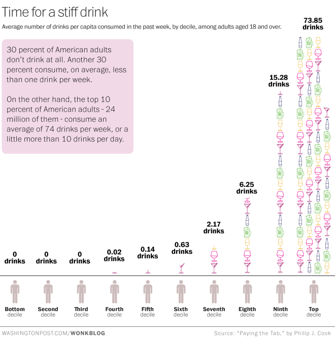
Christopher Ingraham captions:
Do you drink a glass of wine with dinner every night? That puts you in the top 30 percent of American adults in terms of per-capita alcohol consumption. If you drink two glasses, that would put you in the top 20 percent. But in order to break into the top 10 percent of American drinkers, you would need to drink more than two bottles of wine with every dinner. And you’d still be below-average among those top 10 percenters.
9) Interracial Vs Same Sex Marriage:
xkcd’s Randall Munroe contrasts the history of interracial marriage with that of marriage equality:
10) Grand Jury Judgment:
Aaron Blake highlights a poll finding “that 60 percent of Americans disagree with the lack of an indictment against officer Daniel Pantaleo”:
Although 40 percent disagree “strongly” with there being no indictment in Garner’s case, just 24 percent say the same about the case in Ferguson. And in Ferguson, there’s majority support — 52 percent — for no indictment. So basically, Americans as a whole favor no indictment in Ferguson. In Garner’s case, they overwhelmingly think there should have been one. And in fact, just one-quarter of Americans agree with the grand jury’s decision not to indict.
This suggests, does it not, that the gloomiest assessments of America’s ability to see through race are too dire. If we were truly racially polarized, we’d see similar responses to similar white-cop-black-victim scenarios. Which means we have some common ground to stand on.
Vote Here:
Browse our Chart Of The Day archive here. Last year’s winner is here. Polls will close on Wednesday, December 31, at midnight. Winners will be announced soon after. Be sure to vote for the rest of our 2014 awards below:
- Beard Of The Year
- Cool Ad Of The Year
- Face Of The Year
- Hathos Alert Of The Year
- 2014 Malkin Award
- Map Of The Year
- Mental Health Break Of The Year
- Poseur Alert Of The Year
- Window View Of The Year
- 2014 Yglesias Award
Please note: due to there not being enough nominees this year, we will not be issuing a 2014 Hewitt Award, Moore Award, or Dick Morris Award. Learn more about all our awards here.


